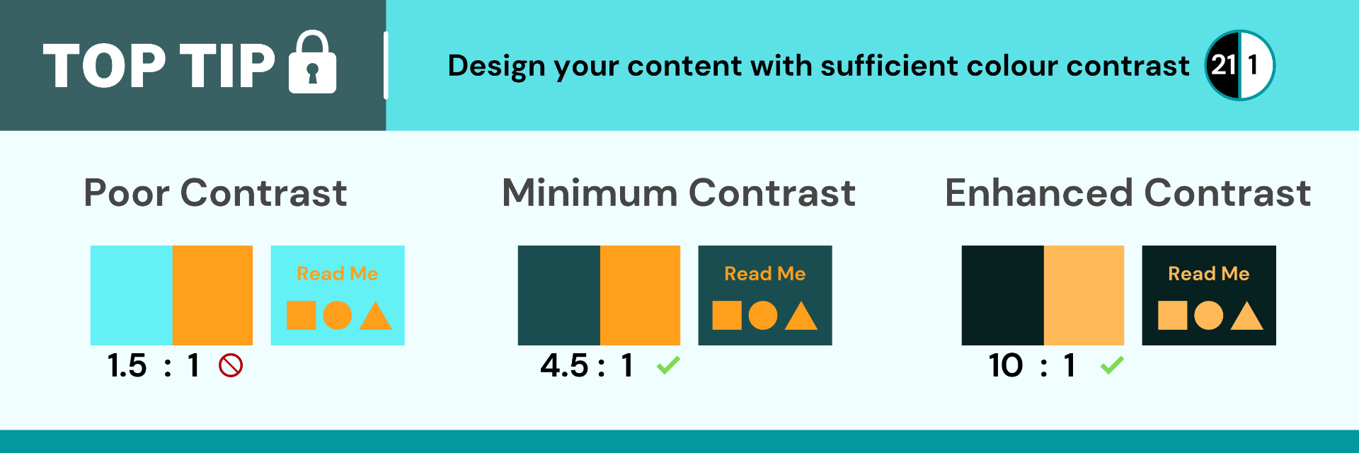
Whether you are designing a research poster, presentation, or learning resource, you want your content to be accessible for your audience. For your content to be more easily perceivable it is important to consider colour contrast particularly between backgrounds and text. For colours to have sufficient contrast they should not just vary in hue (e.g. blue, red or green), there should be a significant difference in tone (e.g. light or dark).
How do I check colour contrast?
There are several tools that can help you assess whether there is sufficient contrast between the colours you use. This could be an online contrast checker tool or an in-built accessibility checker such as the MS Office accessibility checker. If you are uploading your content to My Dundee as an instructor, you can use Blackboard Ally to pick up any colour contrast issues.
Here are some examples of free online contrast checkers you can try:
Find out more about colour and contrast in this Design your Content – Colour and Contrast page.

