
Summary
- Using colour consistently to develop your style and enhance your design.
- Ensuring accessible use of colour and contrast.
Colour
For most of us, colour can have different psychological associations; these can be dependent on context, culture and personal experiences. For example, the colour red can denote anger, pain, danger or conversely could symbolise love, passion or luck. Some of us gravitate towards cooler colours such as blue or warmer colours such as orange. Some of us have colour vision deficiency or low vision which effects the way we see colours.
In the context of educational resources it can be best to keep it simple. Use of colour in a design can help or hinder the clarity and usability of your content. Good use of colour can add visual interest to a design. However, your colour choices and colour placement should be considered carefully to ensure your content is clear and easily perceivable.
Colour Palettes
As discussed in the Style and Consistency section, consistency is key to establishing your own style that your audience can become familiar with. Choosing a set colour palette for your materials can help with this. You may wish to choose a monochromatic colour palette (different shades of the same colour) or a more complex colour palette. Just remember that you should be mindful about how you use your colours. You can design your colour palette so certain colours have certain ‘jobs’.
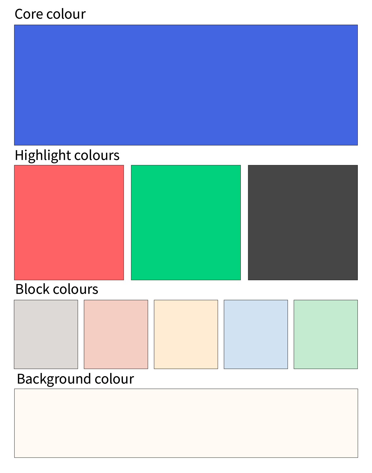
Let’s look at the University of Dundee colour palette as an example. This palette has been designed in four levels:
- Core colour – The signature colour that identifies the University
- Highlight colours – Vibrant tones that are used sparingly within the system
- Block colours – Subtle tones intended for colouring larger flat spaces without overpowering photography
- Background colour – A warm alternative to white for backgrounds
Using Colour Conventions
The examples below use the University of Dundee colour palette to demonstrate how different colour choices can affect the usability of your content. The key elements to note are colour placement, colour contrast and the colour of text. After reading the colour conventions detailed above, which of the examples below do you think works best and why? Let us know in the comments.
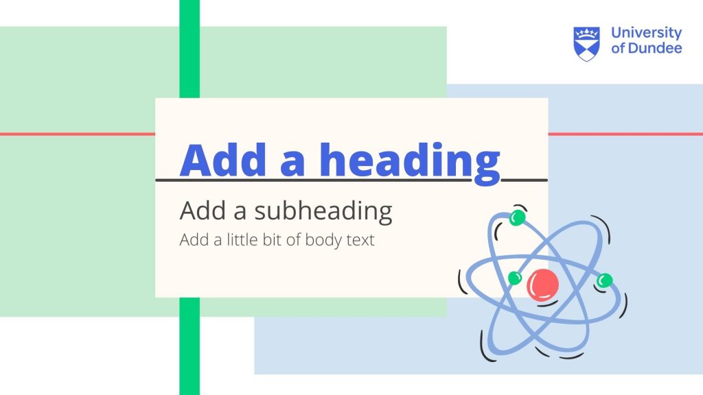
Presentation 1 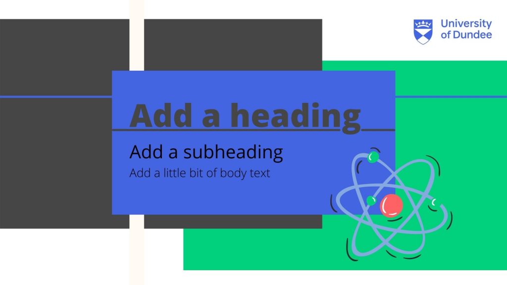
Presentation 2
Colour Contrast
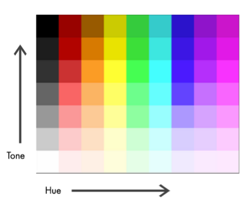
For your content to be more easily perceivable it is important to consider colour contrast particularly between backgrounds and text. What do we mean by colour contrast? Colour contrast is the difference in luminance between two adjacent or overlapping colours (text against a background, for example). For colours to have sufficient contrast they should not just vary in hue (e.g. blue, red or green), there should be a significant difference in tone. The diagram below demonstrates what we mean by colour hue and tone. Here tone refers to the light or dark value of a colour which is traditionally measured in LRV (light reflectance value). This scale runs from black (0 LRV) to white (100 LRV).
How to Assess Colour Contrast
There are several tools that can help you assess whether there is sufficient contrast between the colours you use. This could be an online contrast checker tool or an in-built accessibility checker such as the MS Office accessibility checker. If you are uploading your content to My Dundee, you can use Blackboard Ally to pick up any colour contrast issues.
Here are some examples of free online contrast checkers you can try:
More on Colour Contrast
Web Content Accessibility Guidelines (WCAG)
Whether it is a recorded lecture, presentation slides or an infographic, much of the content that you deliver is viewed by your audience online or on-screen. Many of the contrast checker tools use formulas specified by the World Wide Web Consortium’s Web Content Accessibility Guidelines (WCAG). A sufficient contrast ratio must be reached to achieve the minimum contrast (AA) or enhanced contrast (AAA) specifications. It is important to note that some colour combinations work well for larger text sizes, but not for small text sizes. This may sound like a complex step, but once you have identified your own colour palette you can reuse it.
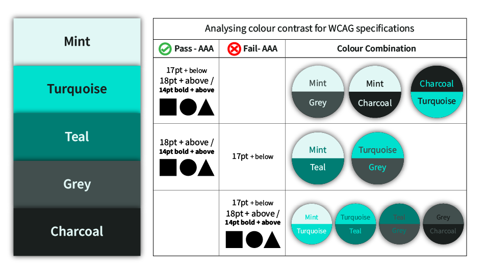
Enhanced Contrast Colour Palette
The colour palette pictured below has been created using the Adobe Colour Wheel and checked using the Adobe Contrast Analyzer. For this particular example, we want our colour combinations to achieve enhanced contrast specifications (AAA). The table below shows the results. From this table we can see that the higher contrasting colour combinations, such as the lightest colour ‘Mint’ with the darkest colour ‘Charcoal’, are suitable for larger text (18pt + above), body text (17pt + below) and graphic elements. Whereas, the colour combination of ‘Teal’ with ‘Grey’ does not provide sufficient contrast and should not be used together. The combinations of ‘Mint’ with ‘Teal’ and ‘Turquoise’ with ‘Grey’ have a sufficient enough contrast to be used for graphic elements, larger text or bold text, but should not be used for body text (17pt + below). Assessing your colours in this way can help you decide which colours to use for which ‘jobs’, as with the University of Dundee colour palette.
Colour Vision Deficiency
Globally, approximately 8% of men and 0.5% of women have a form of colour vision deficiency (RNIB, 2017). Online tools such as Coblis – colour blindness simulator allow you to upload images and test how the colours would appear with different types of colour vision deficiency. Where possible, colour should not be used in isolation to convey information (i.e. colour coding). It is recommended to use a combination of colour, pattern/imagery, or text to signify information.
The pie-charts below display some results to the question ‘which is your favourite season?’ Pie-Chart 1 uses a key where only colour is used to denote the four seasons. Although these colours vary in hue, there is a minimal contrast in tone between these four colours. When viewed in greyscale it becomes very challenging to differentiate between the colours. For people with certain types of colour vision deficiency this pie-chart would be meaningless. Whereas, Pie-Chart 2 uses both pattern and colour to mitigate this and make the information more accessible. Can you think of any other ways to make Pie-Chart 1 more accessible? Let us know in the comments.
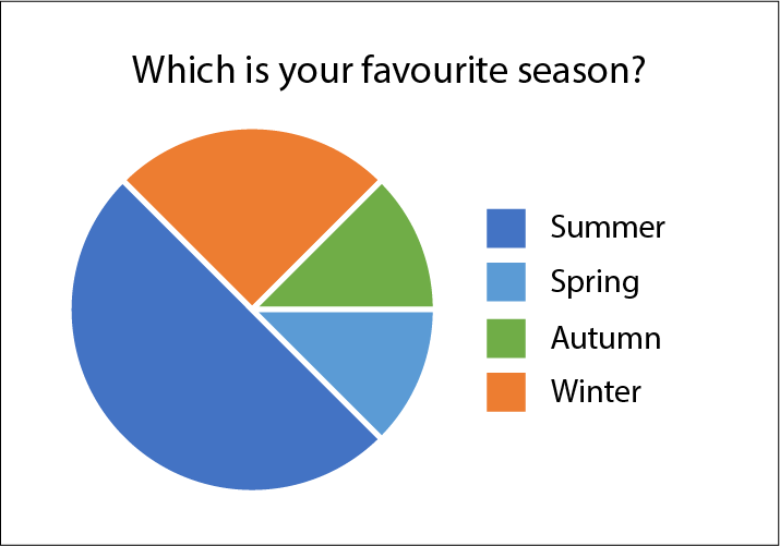
Pie Chart 1 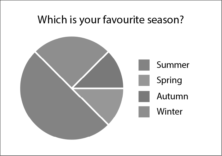
Pie Chart 1 – Greyscale 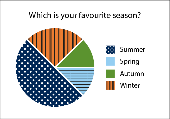
Pie Chart 2 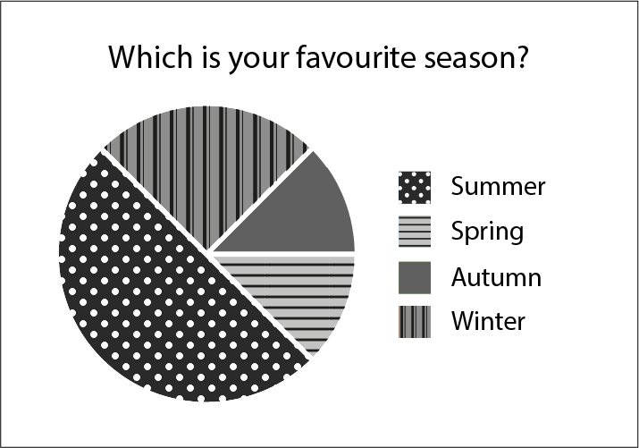
Pie Chart 2 – Greyscale
Further Reading
- Linkedin Learning – Colour in PowerPoint video, 4.25
- Adobe Colour – Accessibility Tools
- How to Test your Brand’s Colour Contrast for Accessibility? – Ability Net
- Colouring for Colourblindness – David Nichols
- Colour Design Theories and Applications – Chap 26. Choosing Effective Colour for Websites
- Colour Vision Deficiency – RNIB (2017)
Activity
Steppingstone – Day 3: Choose your Colour Palette
It is time to choose your colour palette! If you already have a well established colour palette, you could check this for any accessibility issues. You may wish to use the tools we have mentioned on this page, or see if you can find your own tools.
We recommend trying out an online tool such Adobe Color – Color Wheel to help you choose your palette. As discussed, you can use the Adobe Color accessibility tools to check colour contrast and if your palette is colour blind safe.
