Summary
- The importance of fonts – how they help and hinder your content.
- Fonts and readability/accessibility.
Fonts and Typefaces
Every day we are confronted with a variety of typefaces and lettering styles, whether it be public information on a noticeboard, an infographic while scrolling on your phone, or a chapter in a textbook. As a University we have access to a variety of typefaces and fonts, but lettering that works well for commercial projects does not always work for educational content. It is vital that the fonts we use to present our information is clear and easy to read.
Consider the fonts you usually use and why you choose them. Are your fonts easy-to-read? Do you use standard, default fonts such as Calibri or something more decorative?
Choosing your Fonts
While adding a personal creative flair to your material is what makes it individual to you, and personable to your audience, there is a danger that content can become difficult to read if an inappropriate font is selected. Ultimately, adding a decorative font may seem like a fun way to engage your audience, but it can have the opposite effect.
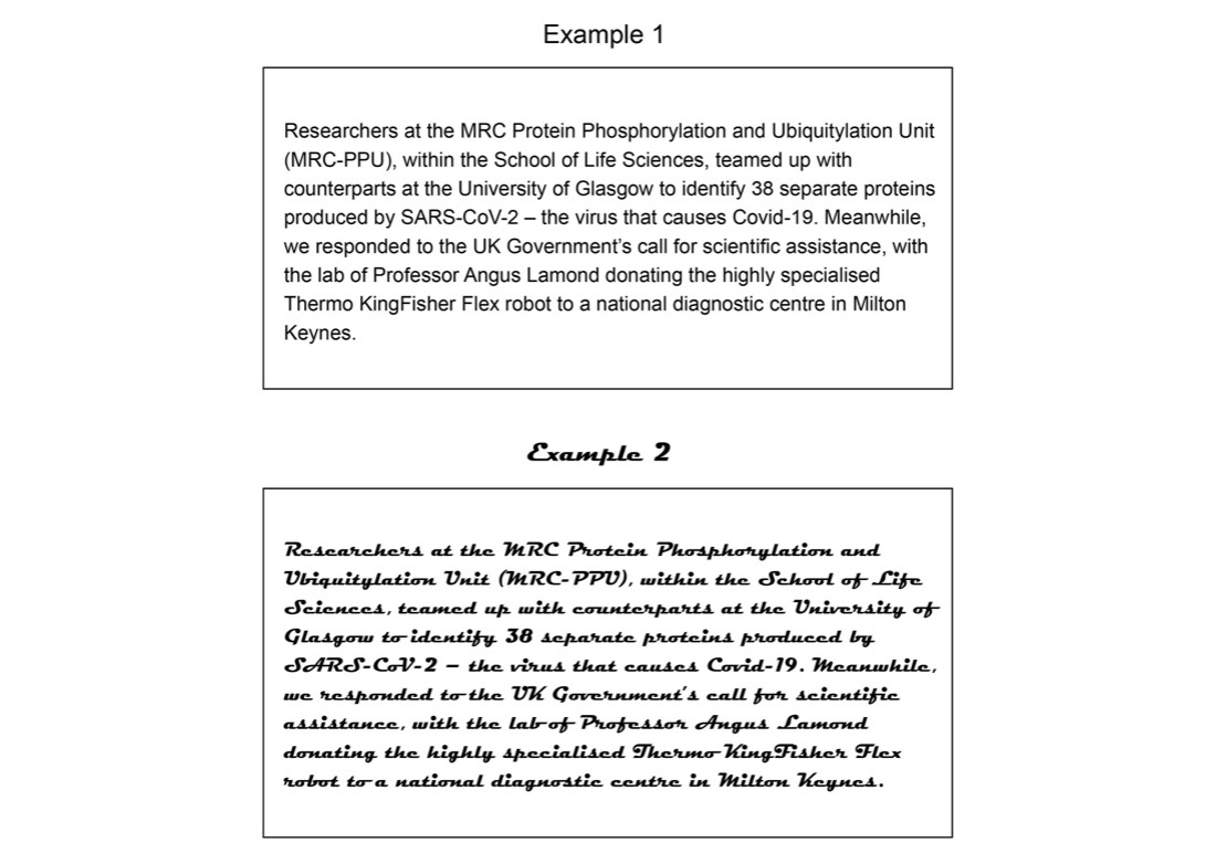
Here are two examples of the same text using different fonts. The text comes from the university article ‘Covid-19: How the Pandemic Forged One Dundee’ available here: https://www.dundee.ac.uk/stories/covid-19-how-pandemic-forged-one-dundee.
Out of the two, which font would you consider to be more successful at delivering information?
Example 1 is Arial, and example 2 is Magneto Bold. As a communicator it is your responsibility to provide information that is easily legible and understandable to the widest audience possible. In example 1 (Arial) the letters stand on their own, and the typography of the characters – the curves and straight lines, for example – are easily distinguishable. In example 2, however, the joint lettering and curves merge the letters together, making them harder to read. The letters are bold (which can be a good way to highlight your information) but in this case, it provides no further legibility.
Accessibility
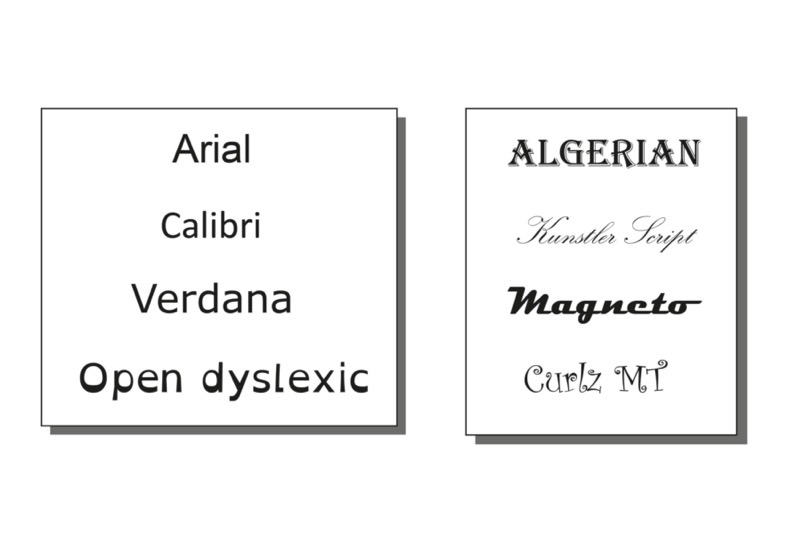
Perhaps you can read both of the examples above equally well. However, before choosing something that works for you, consider the needs of your audience. People with dyslexia can find certain fonts difficult to read, as letters can be read as shapes. The more distinguishable the character, the easier it is for your audience to intake the information you are presenting. Below are a few examples of fonts to consider. Which fonts would you consider more accessible?
As well as benefiting people with reading disabilities, clear fonts can benefit everyone. Consider an audience whose first language is not English, for example. It is important to engage everyone equally. Using fonts that have good letter spacing and easily distinguishable characters can improve intake of information, and you will find it easier to reach your audience as a whole.
Open dyslexic is an open-source typeface that has been created to increase readability for readers with dyslexia. You can download this font from the open dyslexic website. Please make yourself aware of any licence agreements when downloading fonts. See this complete guide to font licensing for designers for more information.
Further Reading
- A guide to what makes a typeface accessible
- The Best Fonts for Dyslexia | Dyslexia | Dyslexic Advantage
- Best Fonts for Dyslexia (tutsplus.com)
- What is Typography, and why is it important? A Beginners Guide
Activity
Steppingstone – Day 5: Choose your Font Family
What are your go-to fonts for your material? After reading this article, would you consider them accessible?
Review your font choice for your selected material and change the font if you think it could be improved.


This goes into a lot more information about fonts & typefaces, including some videos. It’s vaguely centred on the BBC Reith font (a font developed for the BBC)
A Guide to Understanding what makes a typeface accessible