Introduction
Watch this video, to get an overview of Signposting [1:43]
You’ll find the card at slides 17 and 18 in the full slide deck


Moving Online
Signposting is all about making the student’s journey through their module as simple as possible with no barriers or pain points to distract them from their learning. As highlighted in Steve Krug’s web usability book “Don’t Make Me Think: A Common Sense Approach to Web Usability”
“Making every page or screen self-evident is like having good lighting in a store: it just makes everything seem better.” (Krug, 2017)
In the online, self-study, environment we want our students to understand ‘how they can progress through the module and how it all contributes to the overarching learning outcomes of the module’ (GCU Curriculum Design & Development Toolkit for Staff p18). This can be done in a simple way with some effective design principles these include:
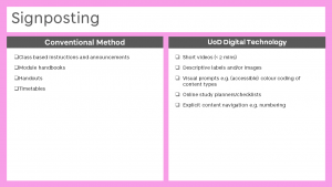
- Break pages into clearly labelled, defined, manageable sections (as highlighted in Acquisition). This avoids the danger of information overload. For example content could be broken down by topic or a specific time frame (i.e. week 1, week 2..)
- Numbering content – Using a hierarchical numbering convention helps identify user progress and location. (For example, if you chose to split by weeks you could have everything to be completed in week 3 given the heading 3.1 The Concept of …, 3.2 Reading material for, 3.3…)
- Avoid nesting content. For example, clicking through multiple layers of folders to find the desired content. (Blackboard Ultra has limited the amount of file hierarchy to help avoid this practise).
- Weekly study planners and checklists.
- Provide clearly written learning goals and objectives, appropriate for the course level and aligned to the desired learning outcomes and module descriptors. [from UoD Module Framework]
- Guide students through the sequence of learning activities and tasks that need to be completed. Make use of conditional (staged) release so that tasks are hidden until prerequisite tasks are completed, or until specific dates. [from UoD Module Framework]
- Simplified language wherever possible.
- Declutter text as much as possible, understanding that white space can be important to allow the student to focus.
- Awareness of readability/accessibility.
(see posts Constructive Alignment & Universal Design)
- Consistency of layout/labelling/numbering conventions.
- Time stamps – useful to clearly show the amount of time required to complete a task in particular for audio and video. For example, 3.4 The Art of Making a Good Cup of Tea [1:44]
We all can get blinded by our own thought processes and lose sight of the student’s goals therefore it can be highly valuable to conduct usability tests. This does not need to be overly complicated and basically requires a fresh pair of eyes looking over your module. This could be a colleague or student however preferably it should be someone outside your area of expertise to make feedback more objective.
Blackboard Ultra – Signposting
One of the key features of Blackboard Ultra is accessibility. With the planned move from Blackboard Learn (current version) to Blackboard Ultra at a module level many of the signposting issues have been improved. A clean, simplified layout, consistent set of icons and accessible navigation structure (bringing key information to the top level) gives clear signposting to the students in an easy, intuitive way.
Blackboard Learn Ultra|video [1:55]
Over to you
In your exploration of other learning providers highlighted in the introduction (FutureLearn, Open University…). Or even your experience of online in general, shopping, researching…can you find some examples of where you thought signposting was effective and examples of when you found the signposting confusing or awkward? Share these examples in the comments box below.
- Think about these examples and share in the comments box below how you could apply the principles to your own module design?
- Think about how you want a student to progress through your module and think about it in terms of a journey. What is the journey you want your students to take? Think about what signposting techniques you could employ to facilitate them?
- Conduct a quick usability test with one of your current modules and try to find insights on how a user interacts and identify possible pain points. Can you use signposting to alleviate these problems?
- Think back to any module evaluations and feedback you have received in the past and consider whether better signposting could have helped address any issues raised. For example, signposting when a student is receiving feedback.
- Finally, one of the most widely used forms of signposting can be the student Handbook, can you think of circumstances that the Handbook could be more valuable than delivering the information in smaller chunks?
Other Dundee resources
Blackboard Ally resource created by University of Dundee students Emma Tennant, Emily Turnbull and illustrations by Daisy Hutton.
References
Houston, S. (no date) Curriculum Design and Development Toolkit for Staff. Glasgow Caledonian University (unpublished)
Krug, S., 2017. Don’t Make Me Think!. [Berkley]: New Riders.
Dundee Exemplary Module Framework 19 May 2020 Version 4


I don’t think the student handbook is particularly valuable – students tend not to read it unless they are specifically referred to read something from it.
Thanks for your comment Renzo, as I see it the student handbook has valuable information in it but as you say if the students are not pushed to read it they tend not to look at it. Is there an opportunity to reduce the scope of the student handbook, and have smaller more focused resources such as the weekly study planners and checklists?
One idea that you might want to think about, and it’s something that quite a lot of Unis are moving to, is to create a Learning Module that effectively has the contents of the Module Handbook in (at least, those sections that are Unique to your module), divided into a number of relevant document items.
That would give the students an easily scannable list of pages, that they’d be able to use when they need them.
Comments that I’ve seen anecdotally from Universities that have moved to that approach (many have) said that students reported using them more than they had in the past.
We kind of do that already through the Business School organisations page. The handbook is just a summary. However, I’m still not convinced students would go to look up things there without prompting.
We have module guides in our school. They are variable depending on the module leader. I wonder if these could effectively be configured with a hierarchy that matches that of the Blackboard Ultra – A simplified guide, with the simple language aligning the module objectives and the assessment points as a roadmap visual. Our schools student handbook increases in content each year. It has invaluable content that is not always read. Signposting in our schools handbook and module guides, which are essential could mirror same labels; definitions and manageable sections enhancing staff and students experience of reading and understanding both.
Hi Christine,
Thanks for the feedback. You’ll hopefully have seen the Module Framework Section 3 – covering the Module Orientation – which forms a lot of what’s in a standard “handbook”. If you’ve got, as suggested the Programme/School level material in a school wide organisation, then It might well be possible to have the module level material in a learning module or folder – and use the BB documents, so that students can easily skim and find the areas that they need at the time.
I agree that students don’t read everything in a handbook …