Summary
- Choosing a style for your content that reflects your topic and is suitable for your audience.
- Utilising a consistent visual style in order to create a familiar and user-friendly experience.
Style
Developing the style of your content and learning resources should be considered in the planning stages. By style, we mean your choice of colour, font, layout, graphics, and anything that adds to the visual presentation of your content. The style of your content should reflect its purpose, suit your audience and can also reveal a little bit about you. The visual presentation of information can affect the way in which it is communicated and received by your audience. Would you use a different visual style if you were presenting to a much younger or older audience? Would your lectures be received differently if you used a different font, such as Comic Sans vs Calibri? We will take a closer look at the specifics of the colour, font, and layout design principles later in this series.
Establishing your Style
Whether it be presentation slides, an educational video or even lecture notes, you can establish your own style that your audience can recognise. Take a moment to consider if there is already an emerging style in your existing learning resources. Identify any consistent elements and take note of them. When planning new material, these elements can then be implemented, and you have begun to encourage a style in your work.
For example:
- Do you always use the same fonts?
- Do text boxes remain in a specific location in your presentation slides?
- Do your images flow from left to right or from top to bottom?
University of Dundee Branding
For marketers and those that communicate on the University’s behalf, please see the University brand guidelines – Brand guidelines | Brand | University of Dundee. Academic staff may wish to use the University branding for external-facing content, such as conference material.
Consistency
Consistency is highlighted in the Dundee Module Baseline in order to improve student engagement and overall experience for online and blended learning. This can also be applied to the visual style of your content and learning resources. A simple, consistent theme can minimise visual intake, reducing cognitive load and encouraging knowledge transfer. Your material can become recognisable, and your audience can focus on the meaning of the content whether it be a complex theory or a set of instructions. In everyday life we thrive from consistency, and this is the same when it comes to communicating information.
Consistent Presentation Layouts
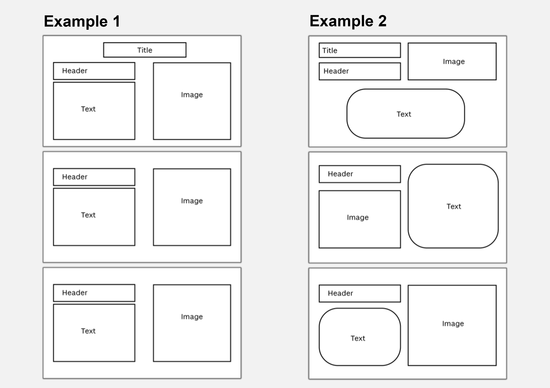
The examples above highlight two ways in which the placement of content can be used consistently in presentation slides. In example 1, the content of each slide follows the same placement as its predecessor. By keeping all elements in a fixed location, your audience will recognise this style and visual/textual information will become easy to follow.
A consistent layout does not have to be linear, as you can see in example 2. The header is located in the same position on each slide. However, the image location alternates from right to left maintaining this pattern throughout the entire presentation; this ensures consistency whilst keeping the layout visually interesting. The text boxes have distinctive curved corners to differentiate them in terms of content; this text box style is used throughout.
Consistent Presentation Themes
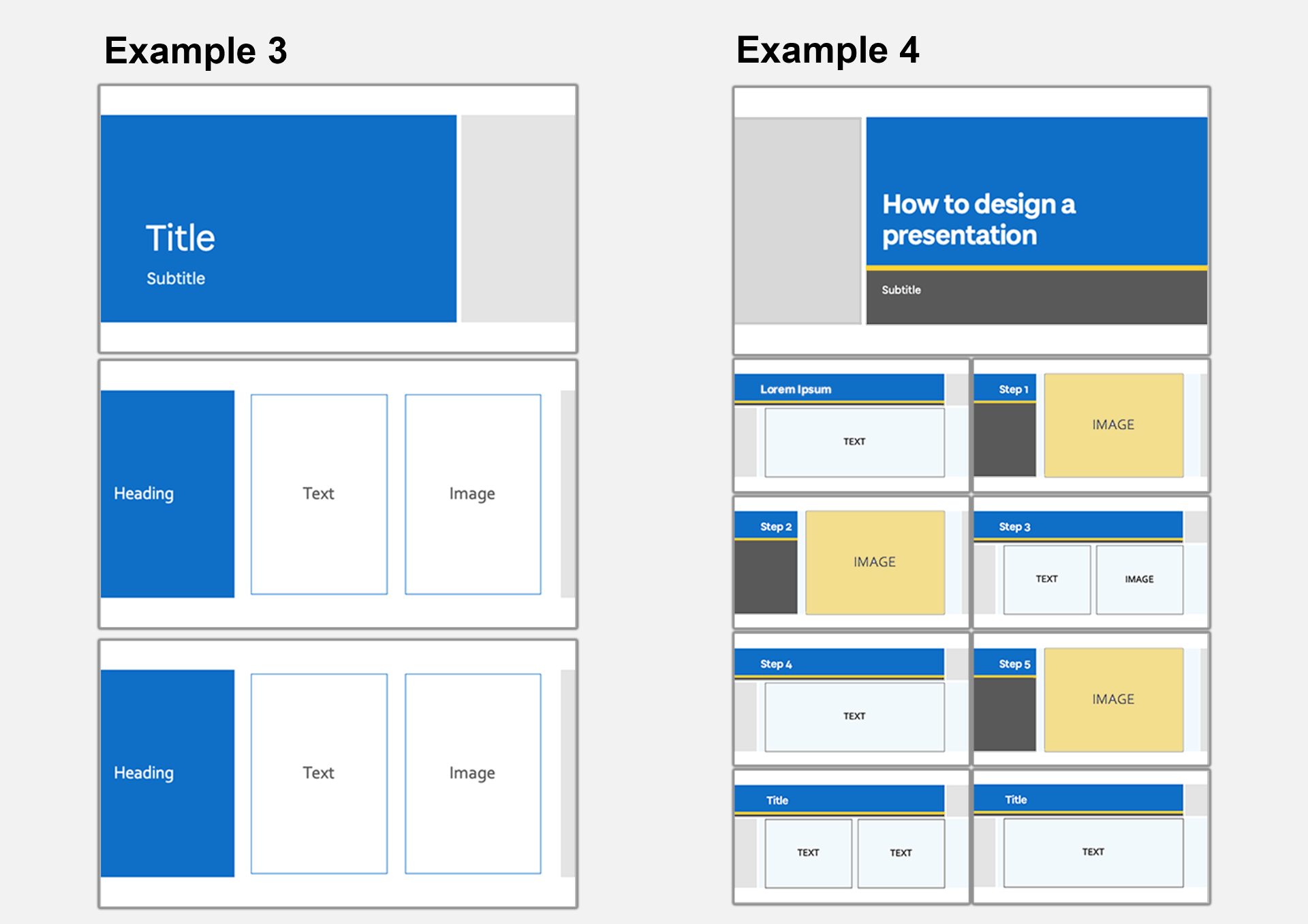
These examples showcase how a PowerPoint theme can be used consistently throughout presentation slides. As you can see in example 3, a simple and consistent style has been used throughout. The top and bottom margins, font and placement of colour established in the title slide remain the same. Although the title slide differs in layout, the placement of colour is consistent with blue on the left and light grey on the right.
In example 4, a similar theme is used in a consistent yet less rigid way. The same colour palette and font is used throughout, however the placement of colour and slide layout changes dependant on the content of the slide. For example, each slide with a single image has the same slide design. Note that although the header box changes in length, the header is placed in the same position on each slide.
Consistent Poster and Infographic Styles

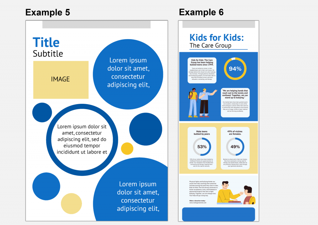
Consistency is just as important when creating infographics, posters and other media-rich documents. In example 5, the title and subheading are easily identifiable, and their position encourages the eye to their location. The use of consistent shapes (in this case, the circles) links the textual information together. The size of the circles differ which creates some depth to the page. This type of design could be used for a poster which needs to be eye-catching with limited information presented.
Example 6 (adapted from a Canva template) also uses consistent styling throughout to communicate information with a similar bold, graphic style. There is a consistent style between the illustrations which suit the subject and complement the shapes used throughout. This infographic uses the same colour palette as previous examples we have looked at demonstrating how you can make use of your style across different types of content. Here example 5 and 6 could easily belong to the same module or set of resources. Although there are differences to the design, the same bold colours and graphic shapes are used, tying the two pieces of content together.
Accessibility
As with user interface design, consistency within the style of your content will improve usability for your audience. One of Jakob Nielsen’s 10 usability heuristics is to ‘maintain consistency and adhere to standards’. For example, consistent use of icons, logo placement and text formatting on a website makes it easier to use. Improving the usability of your content makes it more accessible to your audience. This concept applies to many types of design and can be kept in mind when designing your content.
We will take a closer look at the accessibility points surrounding elements of style such as colour and typefaces later in this series. It is important to note the importance of creating content that is accessible as it is a legal requirement for the University. We recommend reading this guide on creating inclusive teaching materials for an overview of accessibility requirements and some practical help.
Further Reading
- Design principle: Consistency. The most known and most fragile design… | by Anton Nikolov | UX Collective (uxdesign.cc)
- Jamie & Lion: Cognitive Accessibility 101 – Part 1: What is Cognitive Accessibility (jkg3.com)
- Designing for the web: Neurodiversity | Creative Bloq
- 6 Principles Of Visual Accessibility Design – Usability Geek
Activity
Steppingstone Day 2: Consider your Style
To help you establish your own style it can be useful to examine other examples. After considering your usual style choices and identifying any areas of consistency, take a look at examples of content that is similar to what you would like to create. You may wish to do this as a peer review with one of your colleagues or take a look at an Open Educational Resource (OER Commons). What works well and what does not work so well? Is the style used consistently? How could you make this style work for you?
If you co-teach with others, you may wish to discuss your style choices with your colleagues. Do you think it is beneficial to keep a consistent style between content if it is delivered by different lecturers? Should the style be different? Does it matter? Please discuss your thoughts in the comments below.