5: Fonts and Typefaces

Examples of more accessible fonts (Arial, Calibri, Verdana and Open Dyslexic) and less accessible fonts (Algerian, , Magnet and Curls MT)
Reading Time: 3 minutes

Summary

  • The importance of fonts – how they help and hinder your content.
  • Fonts and readability/accessibility.

Fonts and Typefaces

The typeface Baxter Sans alongside the fonts Baxter Sans Regular, Baxter Sans Italic and Baxter Sans Bold

Every day we are confronted with a variety of typefaces and lettering styles, whether it be public information on a noticeboard, an infographic while scrolling on your phone, or a chapter in a textbook. As a University we have access to a variety of typefaces and fonts, but lettering that works well for commercial projects does not always work for educational content. It is vital that the fonts we use to present our information is clear and easy to read.

Consider the fonts you usually use and why you choose them. Are your fonts easy-to-read? Do you use standard, default fonts such as Calibri or something more decorative?

Choosing your Fonts

While adding a personal creative flair to your material is what makes it individual to you, and personable to your audience, there is a danger that content can become difficult to read if an inappropriate font is selected. Ultimately, adding a decorative font may seem like a fun way to engage your audience, but it can have the opposite effect.

Here are two examples of the same text using different fonts. The text comes from the university article ‘Covid-19: How the Pandemic Forged One Dundee’ available here: https://www.dundee.ac.uk/stories/covid-19-how-pandemic-forged-one-dundee.

Out of the two, which font would you consider to be more successful at delivering information?

Image comparing text in two different fonts - Arial and Magneto Bold

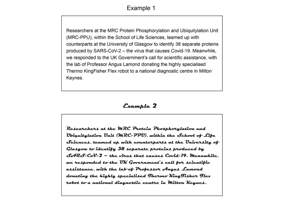
Example 1 is Arial, and example 2 is Magneto Bold. As a communicator it is your responsibility to provide information that is easily legible and understandable to the widest audience possible. In example 1 (Arial) the letters stand on their own, and the typography of the characters – the curves and straight lines, for example – are easily distinguishable. In example 2, however, the joint lettering and curves merge the letters together, making them harder to read. The letters are bold (which can be a good way to highlight your information) but in this case, it provides no further legibility.

Accessibility

Perhaps you can read both of the examples above equally well. However, before choosing something that works for you, consider the needs of your audience. People with dyslexia can find certain fonts difficult to read, as letters can be read as shapes. The more distinguishable the character, the easier it is for your audience to intake the information you are presenting. Below are a few examples of fonts to consider. Which fonts would you consider more accessible?

Examples of more accessible fonts (Arial, Calibri, Verdana and Open Dyslexic) and less accessible fonts (Algerian, Kunstler Script, Magnet and Curls MT)

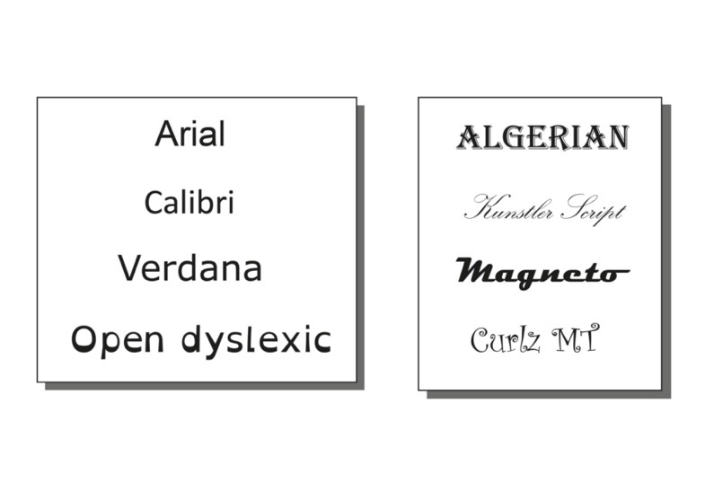
As well as benefiting people with reading disabilities, clear fonts can benefit everyone. Consider an audience whose first language is not English, for example. It is important to engage everyone equally. Using fonts that have good letter spacing and easily distinguishable characters can improve intake of information, and you will find it easier to reach your audience as a whole.

Open dyslexic is an open-source typeface that has been created to increase readability for readers with dyslexia. You can download this font from the open dyslexic website. Please make yourself aware of any licence agreements when downloading fonts. See this complete guide to font licensing for designers for more information.

Further Reading

Activity

Steppingstone – Day 5: Choose your Font Family

What are your go-to fonts for your material? After reading this article, would you consider them accessible?

Review your font choice for your selected material and change the font if you think it could be improved.

6: Design Principles in Context

process showing the breakdown of a 2 hour synchronous session into short pre-recorded videos with activities in between
Reading Time: 3 minutes

Summary

  • Taking a look at some examples of different types of media.
  • Useful resources and software for creating your content.

Infographics

An infographic can be described as a visual representation of information or data. This may be in the form of an infographic poster or an image within a presentation, for example. Infographics can work really well to explain processes or to simply complex data into something visual (this is also known as data visualisation).

Using infographics

Below are some ways you may wish to use an infographic. Can you think of any more?

  • A visual overview of weekly activities in a module
  • Represent results of an experiment
  • Simplify a complex set of instructions
  • Graphical abstract for a paper

Infographics – Software and Resources

Using MS office, you will find that you can use basic shapes, icons and charts to create infographics for your content. This video by Educational Technologist, James Kieft shows you how to create an infographic in PowerPoint.

There are also many infographic software websites available online including Canva (sign-up required) and Adobe Spark (sign-in with staff email address). These sites offer you a range of templates, in-built tools and media to help you get creative.

Presentations

We have used presentation slides as examples throughout this Learning X series. In summary, when designing your presentation slides you should consider:

  • Consistency, such as the colours used or the placement of headings
  • Visual hierarchy and layout
  • The balance between text and graphic elements
  • Sufficient negative space and consistent margins
  • Significant contrast between colours (particularly text and background)
  • Simple, clear typefaces and fonts

Design and Accessibility for PowerPoint

PowerPoint Video 1 – Improving Design Accessibility
PowerPoint Video 2 – Accessibility Checker

Presentations – Software and Resources

Video

Check out our Learning X series on Effective Videos for Education for more information!

  1. Planning
  2. Engagement and delivery style
  3. Video ready teaching materials
  4. Recording video for education
  5. Editing video for education
  6. Summary and references

Accessibility

It is worth thinking about files in which your audience cannot easily edit the formatting (for example, a video or PDF). If you provide an additional copy of the original file (for example, a PowerPoint presentation) the text, the colours and the design can be customised by the audience to meet any specific needs they have. Text can be increased in size or the colours changes for any visual or neurological needs. It is still important to keep to professional standards and use a design that is accessible as possible from the get-go.

Activity

Steppingstone – Day 6: Finalise your Visuals

By now you should have made some progress with your design and have hopefully started to think about developing your visual style. The next stepping stone is to ‘finalise your visuals’. This will be dependent on the type of content you are creating. It may be creating slides for a pre-recorded lecture or adding text / images to an infographic.

Today’s is mainly about research and discussion. Let us know how you have been getting on so far in the comments. Please reach out with any questions you may have.

7: Conclusion

Reading Time: < 1 minutes

Final Steps

Steppingstones – Day 7: Final Steps

At this point you may have a draft piece of content, a finished design or you may still want to refine your ideas. Once you have a solid design plan or a first draft you can review what you have created to avoid any mishaps later. Often it can help to have a short break from working on your content and come back to it to review it.

Other than reviewing the design principles we have mentioned, you may also want to consider:

  • Is the piece visually engaging? Is it too visually distracting?
  • Have you communicated your message clearly and concisely?
  • Can you ask a colleague to critique your design?
  • Have you checked for accessibility issues?

Once you are happy with your content it is time to prepare it for delivery and release it to your audience.

Conclusion

We hope you have enjoyed this Learning X and have found it useful. Please do come back to the resources we have provided and feel free to use our stepping stones approach when designing or redesigning your content in the future.

There will be a short Q&A session next week in the EduZone 2.0 channel to carry on the discussion and respond to any questions we have gained (University of Dundee staff only).

Ask us your questions and provide us with feedback anonymously via this mentimeter (<5 mins).