Welcome to Design your Content. In this Learning X series, we will be taking you through the principles of design in the context of creating content and media for education. You will start with a topic in mind and work on designing or redesigning a piece of content based on this topic as you work through the week. In a couple of week’s time we will be having a follow-up session where you’ll get your chance to ask us questions and discuss your thoughts.
To get started you need to determine the topic that you are going to be working with during this series. You may already have a topic in mind, or you can choose one of the following options:
Choose a topic that may be difficult to teach and use this guide to create brand new material on the subject.
Revisit material you have already made and use this guide to check, improve or redesign your content.
Choose our example (below) – ‘Design a welcome infographic/poster for your module’.
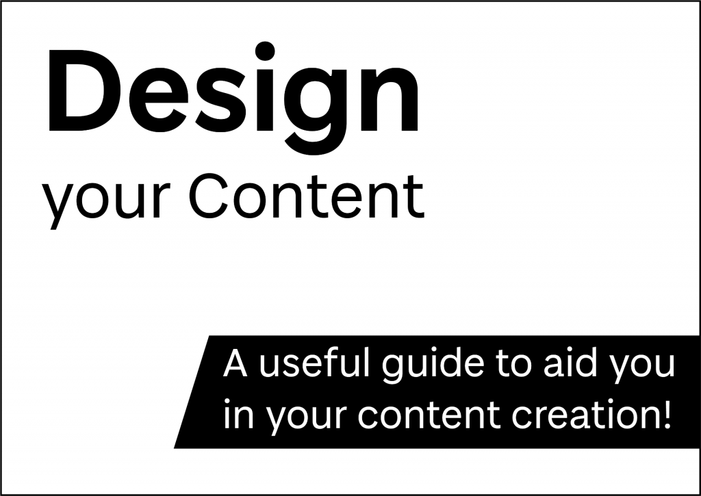
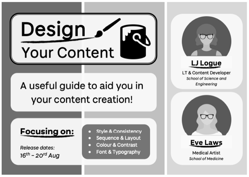
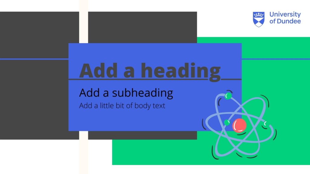
Design your Content – Welcome Poster
The poster below was created specifically for this Learning X series using a tool we all have access to – Microsoft PowerPoint. It introduces the topic, the instructors and dates using a simple graphic style. We will be using this as an example throughout to show you how the design principles can be applied at each stage. Can you design something similar to introduce your students to your module?
Once you have determined your topic, think about the format of your content. Are you creating a video, a recorded lecture, a poster, an infographic or something else? If you are adapting a lecture for blended learning, can you split this into a series of shorter videos? At this point you can gather your research and any existing material you can use (e.g. photographs or diagrams). Feel free to introduce yourself and let us know what you have decided to work on in the comments below.
Choosing a style for your content that reflects your topic and is suitable for your audience.
Utilising a consistent visual style in order to create a familiar and user-friendly experience.
Style
Developing the style of your content and learning resources should be considered in the planning stages. By style, we mean your choice of colour, font, layout, graphics, and anything that adds to the visual presentation of your content. The style of your content should reflect its purpose, suit your audience and can also reveal a little bit about you. The visual presentation of information can affect the way in which it is communicated and received by your audience. Would you use a different visual style if you were presenting to a much younger or older audience? Would your lectures be received differently if you used a different font, such as Comic Sans vs Calibri? We will take a closer look at the specifics of the colour, font, and layout design principles later in this series.
Establishing your Style
Whether it be presentation slides, an educational video or even lecture notes, you can establish your own style that your audience can recognise. Take a moment to consider if there is already an emerging style in your existing learning resources. Identify any consistent elements and take note of them. When planning new material, these elements can then be implemented, and you have begun to encourage a style in your work.
For example:
Do you always use the same fonts?
Do text boxes remain in a specific location in your presentation slides?
Do your images flow from left to right or from top to bottom?
University of Dundee Branding
For marketers and those that communicate on the University’s behalf, please see the University brand guidelines – Brand guidelines | Brand | University of Dundee. Academic staff may wish to use the University branding for external-facing content, such as conference material.
Consistency
Consistency is highlighted in the Dundee Module Baseline in order to improve student engagement and overall experience for online and blended learning. This can also be applied to the visual style of your content and learning resources. A simple, consistent theme can minimise visual intake, reducing cognitive load and encouraging knowledge transfer. Your material can become recognisable, and your audience can focus on the meaning of the content whether it be a complex theory or a set of instructions. In everyday life we thrive from consistency, and this is the same when it comes to communicating information.
Consistent Presentation Layouts
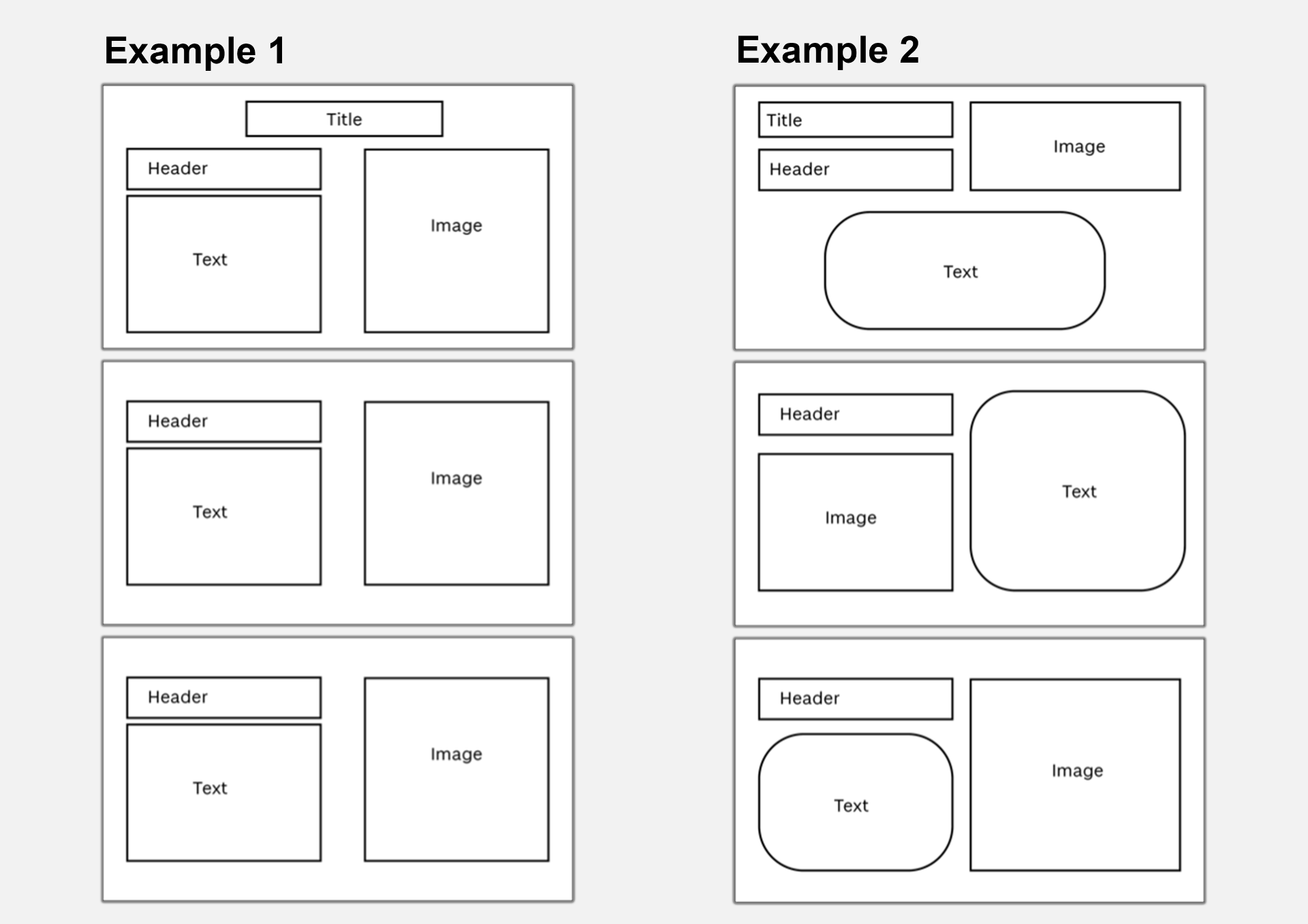
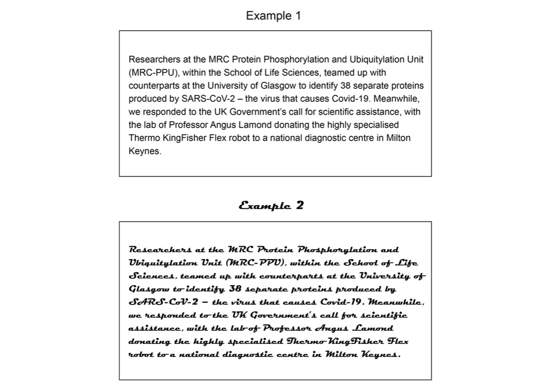
Examples 1 and 2: showing consistent presentation layouts
The examples above highlight two ways in which the placement of content can be used consistently in presentation slides. In example 1, the content of each slide follows the same placement as its predecessor. By keeping all elements in a fixed location, your audience will recognise this style and visual/textual information will become easy to follow.
A consistent layout does not have to be linear, as you can see in example 2. The header is located in the same position on each slide. However, the image location alternates from right to left maintaining this pattern throughout the entire presentation; this ensures consistency whilst keeping the layout visually interesting. The text boxes have distinctive curved corners to differentiate them in terms of content; this text box style is used throughout.
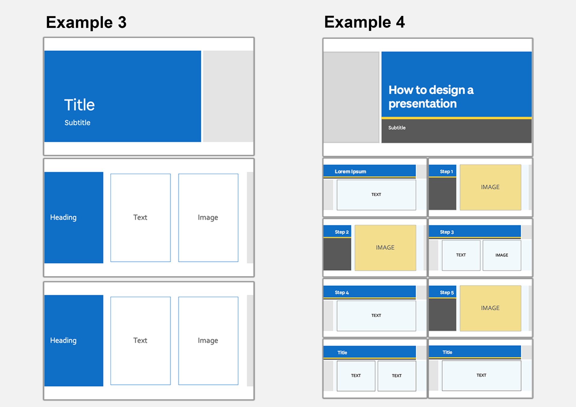
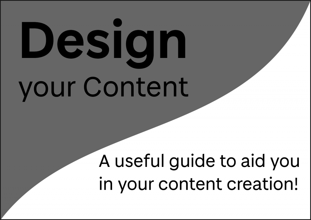
Consistent Presentation Themes
Examples 3 and 4: showing consistent presentation themes
These examples showcase how a PowerPoint theme can be used consistently throughout presentation slides. As you can see in example 3, a simple and consistent style has been used throughout. The top and bottom margins, font and placement of colour established in the title slide remain the same. Although the title slide differs in layout, the placement of colour is consistent with blue on the left and light grey on the right.
In example 4, a similar theme is used in a consistent yet less rigid way. The same colour palette and font is used throughout, however the placement of colour and slide layout changes dependant on the content of the slide. For example, each slide with a single image has the same slide design. Note that although the header box changes in length, the header is placed in the same position on each slide.
Consistent Poster and Infographic Styles
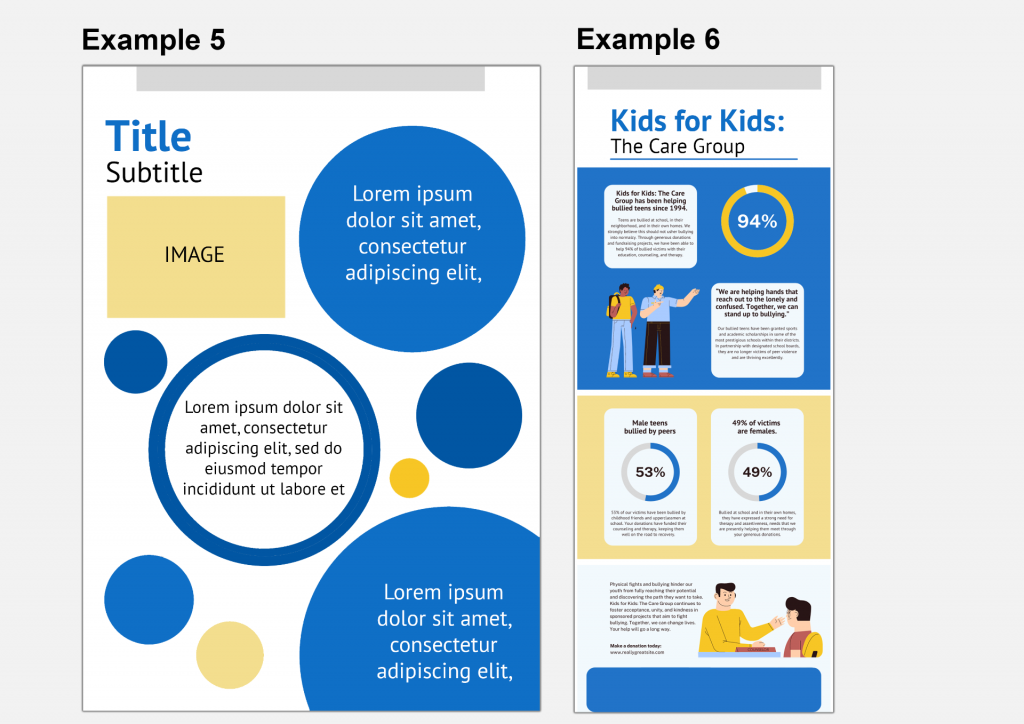
Examples 5 and 6: showing consistent infographic and poster styles
Consistency is just as important when creating infographics, posters and other media-rich documents. In example 5, the title and subheading are easily identifiable, and their position encourages the eye to their location. The use of consistent shapes (in this case, the circles) links the textual information together. The size of the circles differ which creates some depth to the page. This type of design could be used for a poster which needs to be eye-catching with limited information presented.
Example 6 (adapted from a Canva template) also uses consistent styling throughout to communicate information with a similar bold, graphic style. There is a consistent style between the illustrations which suit the subject and complement the shapes used throughout. This infographic uses the same colour palette as previous examples we have looked at demonstrating how you can make use of your style across different types of content. Here example 5 and 6 could easily belong to the same module or set of resources. Although there are differences to the design, the same bold colours and graphic shapes are used, tying the two pieces of content together.
Accessibility
As with user interface design, consistency within the style of your content will improve usability for your audience. One of Jakob Nielsen’s 10 usability heuristics is to ‘maintain consistency and adhere to standards’. For example, consistent use of icons, logo placement and text formatting on a website makes it easier to use. Improving the usability of your content makes it more accessible to your audience. This concept applies to many types of design and can be kept in mind when designing your content.
We will take a closer look at the accessibility points surrounding elements of style such as colour and typefaces later in this series. It is important to note the importance of creating content that is accessible as it is a legal requirement for the University. We recommend reading this guide on creating inclusive teaching materials for an overview of accessibility requirements and some practical help.
To help you establish your own style it can be useful to examine other examples. After considering your usual style choices and identifying any areas of consistency, take a look at examples of content that is similar to what you would like to create. You may wish to do this as a peer review with one of your colleagues or take a look at an Open Educational Resource (OER Commons). What works well and what does not work so well? Is the style used consistently? How could you make this style work for you?
If you co-teach with others, you may wish to discuss your style choices with your colleagues. Do you think it is beneficial to keep a consistent style between content if it is delivered by different lecturers? Should the style be different? Does it matter? Please discuss your thoughts in the comments below.
Planning the sequence and visual hierarchy of your content.
Designing a well-structured and consistent layout.
Sequence
When planning a lecture, seminar or workshop you consider the sequence of activities and structure of your session in order to optimise the student experience. This thinking can be applied to the design of your learning materials, whether it be the sequence of a video or the layout of an infographic. A well-structured design can allow information to be communicated in a way that is memorable and easy to understand.
Visual Hierarchy
Considering visual hierarchy can help you to communicate a message clearly by highlighting important information and reducing extraneous load. This is particularly important with a set of instructions or a process, but can be applied to any content. The visual hierarchy of a design determines the sequence in which the audience views your content and visually ranks elements in terms of importance. You can use design elements such as scale, colour/contrast, layout and typeface to visually rank your content. Richard Mayer’s Signalling Principle states that “people learn better when cues that highlight the organization of the essential material are added.” (2009a, p. 108) However, this should be done subtly as not to overwhelm.
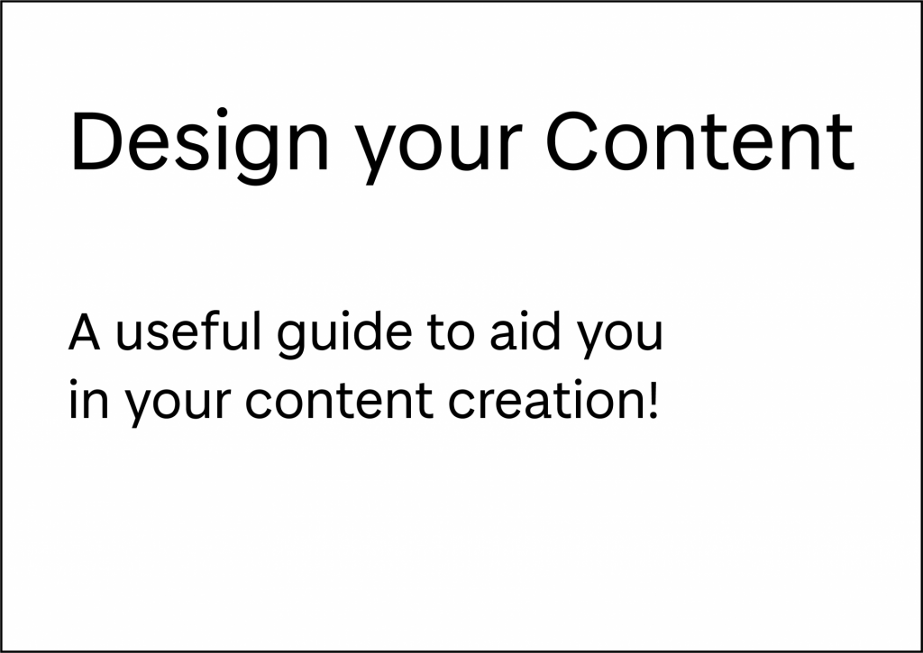
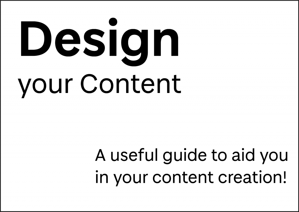
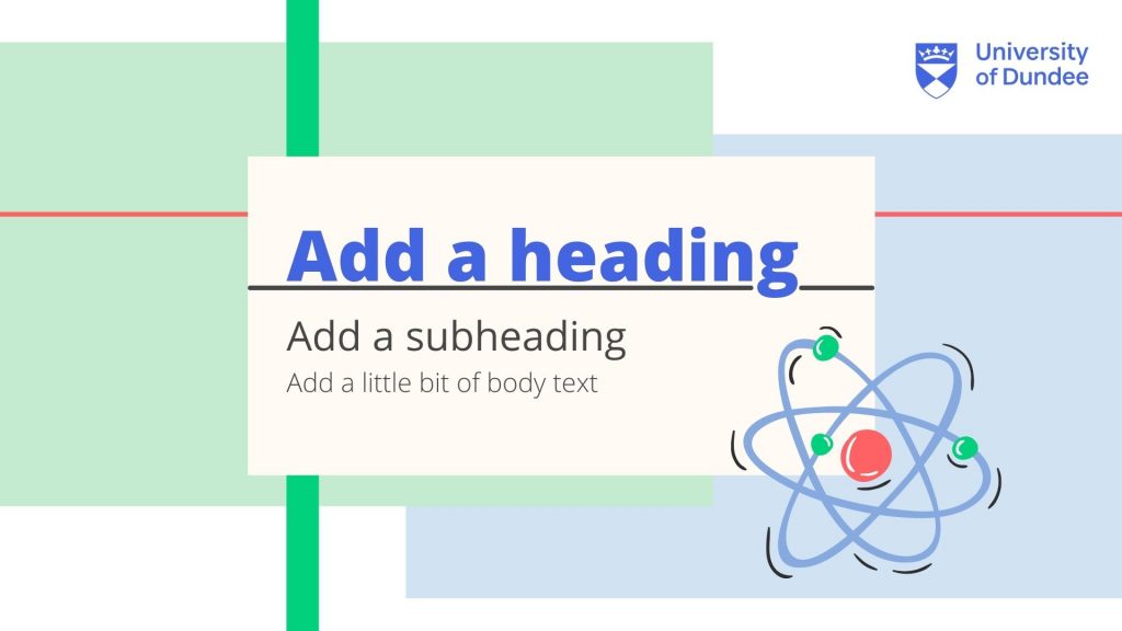
Visual Hierarchy: Example 1
Visual Hierarchy: Example 2
Visual Hierarchy: Example 3
Visual Hierarchy: Example 4
The examples above show how simple changes in design can affect the visual importance of an element. In example 1 you notice the title first and then the subheading, but at glance neither particularly stand out. In example 2 the title is much more pronounced, particularly the word ‘design’. In example 3 the title and subheading appear more balanced by adding a high contrast shape behind the subtitle. In example 4 the low contrast of the shape behind the title changes the balance so that the subtitle stands out the most. To help you with visual hierarchy ask yourself – which is the most important information? Is the reading order clear? What stands out on the page?
Layout
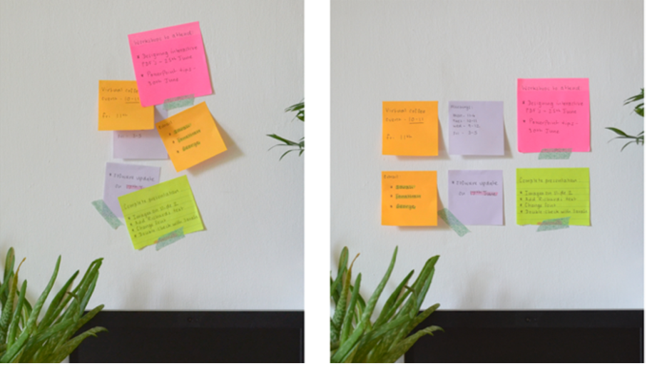
To get you to start thinking about layout, lets have a look at some post-it notes. Post-it notes are designed to organise key segments of information, and these should be clear at a glance for optimum efficiency. If their layout is not carefully considered, and the post-it notes are overlapped, information can be forgotten or disregarded – the same applies to designing the layout of your material. Post-it notes can be a great tool for planning both sequence and layout of your content.
Planning your Layout
When designing the layout of your content, as well as the sequence of information you should also consider:
The balance between text and graphic elements. This will be dependent on your subject and the type of content that you are creating. This summary of Mayer’s Multimedia Learning Principles (2009b) includes some practical advise on the balance of text and images.
The alignment of your text and graphic elements. Is your text all left-aligned or does it change throughout? Are your images neatly arranged? Many of the tools you can use to create your content, such as Microsoft office, have built-in alignment tools.
Margins and negative space. Is there significant space between the edge of the page and your text/visual elements? Avoid over-crowding your pages or slides as this can be difficult to read and absorb information.
Orientation and aspect ratio. Is your page portrait or landscape? Does it have to be A4 or can it be custom? If you are creating a video, the standard aspect ratio is 16:9.
Consistency. Remember an element of consistency throughout your layout will improve the usability of your content.
Reviewing your Layout
When you begin to add text and graphic elements to your design you may have to readjust your layout as you go along. Remember that the steps we describe in this Learning X are like stepping stones, they are not one-way, you can go back and forth through the steps until you are happy with your design.
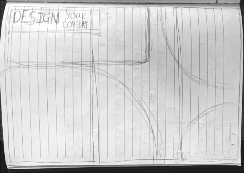
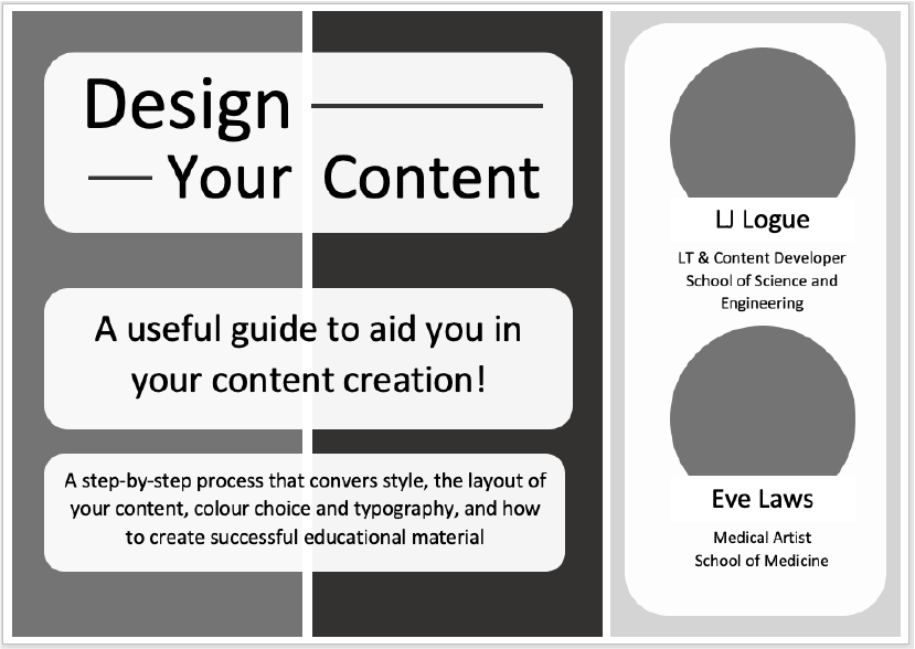
Let’s take a look at how the layout of our ‘Design your Content poster’ changed throughout the design and creation process. First we started with a very simple hand-drawn sketch with block shapes and a rough idea of where the title would be. This sketch was then digitised blocking out the shapes in greyscale. As content was added to the poster the layout changed and was refined until we reached the final design. Notice how the blocks of content are neatly aligned and there is a margin between the content and the edge of the page. Is there anything you would change about this final layout? Does the visual hierarchy flow in a way you would expect? Let us know your thoughts in the comments.
Initial hand-drawn sketch
Digitised sketch
Refined layout
Final layout
Accessibility
Visual hierarchy can highlight key points in your design to improve the intake of information presented. However, remember that the underlying structure of your documents should also be optimised so that students with visual impairments or mobility needs can navigate the content effectively. You can check the reading order of your PowerPoint slides using the reading order pane and PDFs using Adobe Acrobat’s reading order tool. You may also wish to use a screen-reader tool to check your content.
As highlighted in the University of Dundee guide – creating inclusive teaching materials – Microsoft’s in-built tools can be used to ensure the structure of your content is accessible:
‘Use Styles in MS Word (Heading 1, 2, etc.) to help students navigate the content. In PowerPoint, use the Title box for slide titles and make sure these are unique. This will improve the experience for any student using a screen-reader and will improve readability for all.’
Take a few minutes to create a rough plan of the layout or sequence of your content, considering the points mentioned above. Do not consider the colour scheme or fonts just yet, as these will be covered on the following pages. Here are some ideas of how you could go about this:
For posters, infographics, or PDFs:
Create a quick sketch (stick men or rough shapes will do fine)
Using colour consistently to develop your style and enhance your design.
Ensuring accessible use of colour and contrast.
Colour
For most of us, colour can have different psychological associations; these can be dependent on context, culture and personal experiences. For example, the colour red can denote anger, pain, danger or conversely could symbolise love, passion or luck. Some of us gravitate towards cooler colours such as blue or warmer colours such as orange. Some of us have colour vision deficiency or low vision which effects the way we see colours.
In the context of educational resources it can be best to keep it simple. Use of colour in a design can help or hinder the clarity and usability of your content. Good use of colour can add visual interest to a design. However, your colour choices and colour placement should be considered carefully to ensure your content is clear and easily perceivable.
Colour Palettes
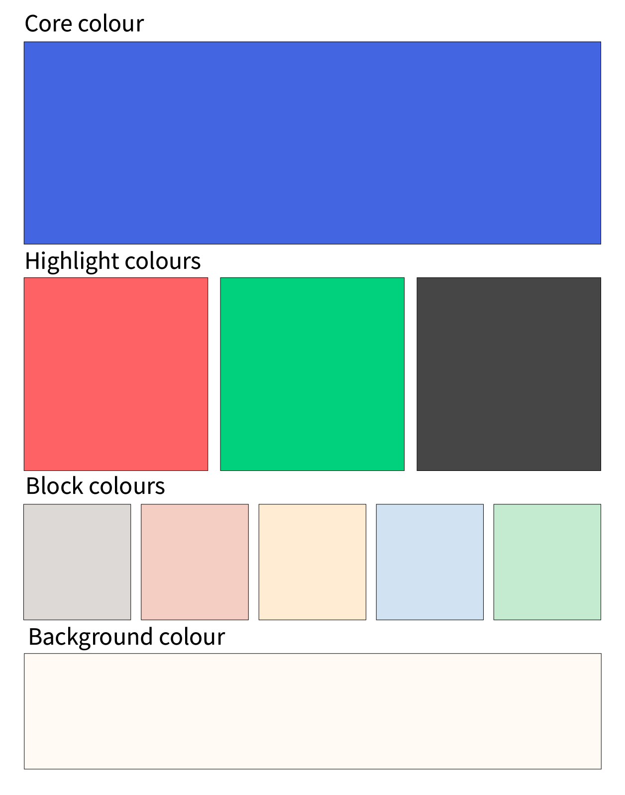
As discussed in the Style and Consistency section, consistency is key to establishing your own style that your audience can become familiar with. Choosing a set colour palette for your materials can help with this. You may wish to choose a monochromatic colour palette (different shades of the same colour) or a more complex colour palette. Just remember that you should be mindful about how you use your colours. You can design your colour palette so certain colours have certain ‘jobs’.
Core colour – The signature colour that identifies the University
Highlight colours – Vibrant tones that are used sparingly within the system
Block colours – Subtle tones intended for colouring larger flat spaces without overpowering photography
Background colour – A warm alternative to white for backgrounds
Using Colour Conventions
The examples below use the University of Dundee colour palette to demonstrate how different colour choices can affect the usability of your content. The key elements to note are colour placement, colour contrast and the colour of text. After reading the colour conventions detailed above, which of the examples below do you think works best and why? Let us know in the comments.
Presentation 1
Presentation 2
Colour Contrast
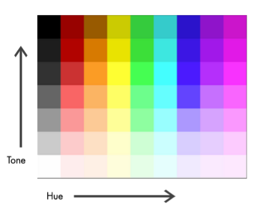
For your content to be more easily perceivable it is important to consider colour contrast particularly between backgrounds and text. What do we mean by colour contrast? Colour contrast is the difference in luminance between two adjacent or overlapping colours (text against a background, for example). For colours to have sufficient contrast they should not just vary in hue (e.g. blue, red or green), there should be a significant difference in tone. The diagram below demonstrates what we mean by colour hue and tone. Here tone refers to the light or dark value of a colour which is traditionally measured in LRV (light reflectance value). This scale runs from black (0 LRV) to white (100 LRV).
How to Assess Colour Contrast
There are several tools that can help you assess whether there is sufficient contrast between the colours you use. This could be an online contrast checker tool or an in-built accessibility checker such as the MS Office accessibility checker. If you are uploading your content to My Dundee, you can use Blackboard Ally to pick up any colour contrast issues.
Here are some examples of free online contrast checkers you can try:
Whether it is a recorded lecture, presentation slides or an infographic, much of the content that you deliver is viewed by your audience online or on-screen. Many of the contrast checker tools use formulas specified by the World Wide Web Consortium’s Web Content Accessibility Guidelines (WCAG). A sufficient contrast ratio must be reached to achieve the minimum contrast (AA) or enhanced contrast (AAA) specifications. It is important to note that some colour combinations work well for larger text sizes, but not for small text sizes. This may sound like a complex step, but once you have identified your own colour palette you can reuse it.
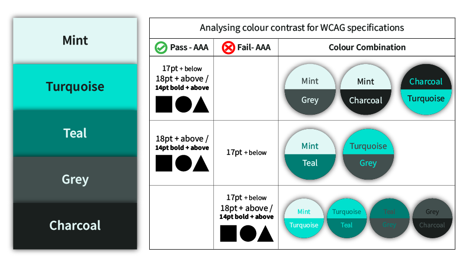
Enhanced Contrast Colour Palette
The colour palette pictured below has been created using the Adobe Colour Wheel and checked using the Adobe Contrast Analyzer. For this particular example, we want our colour combinations to achieve enhanced contrast specifications (AAA). The table below shows the results. From this table we can see that the higher contrasting colour combinations, such as the lightest colour ‘Mint’ with the darkest colour ‘Charcoal’, are suitable for larger text (18pt + above), body text (17pt + below) and graphic elements. Whereas, the colour combination of ‘Teal’ with ‘Grey’ does not provide sufficient contrast and should not be used together. The combinations of ‘Mint’ with ‘Teal’ and ‘Turquoise’ with ‘Grey’ have a sufficient enough contrast to be used for graphic elements, larger text or bold text, but should not be used for body text (17pt + below). Assessing your colours in this way can help you decide which colours to use for which ‘jobs’, as with the University of Dundee colour palette.
Colour Vision Deficiency
Globally, approximately 8% of men and 0.5% of women have a form of colour vision deficiency (RNIB, 2017). Online tools such as Coblis – colour blindness simulator allow you to upload images and test how the colours would appear with different types of colour vision deficiency. Where possible, colour should not be used in isolation to convey information (i.e. colour coding). It is recommended to use a combination of colour, pattern/imagery, or text to signify information.
Created by students Emma Tennant, Emily Turnbull and illustrations by Daisy Hutton
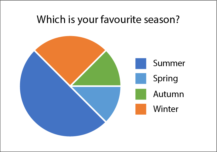
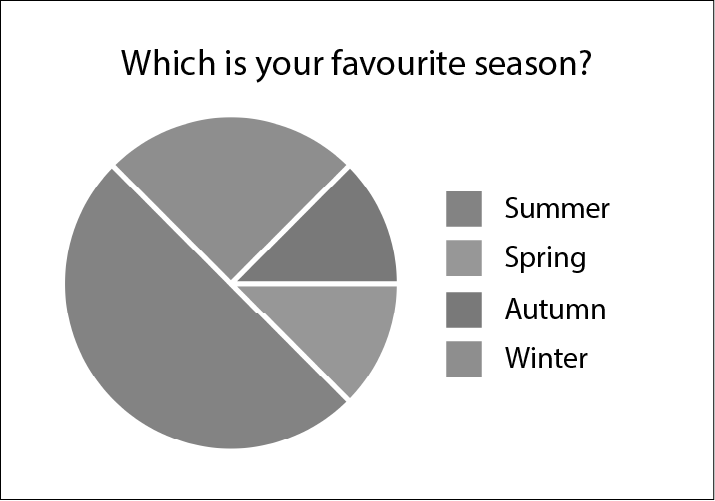
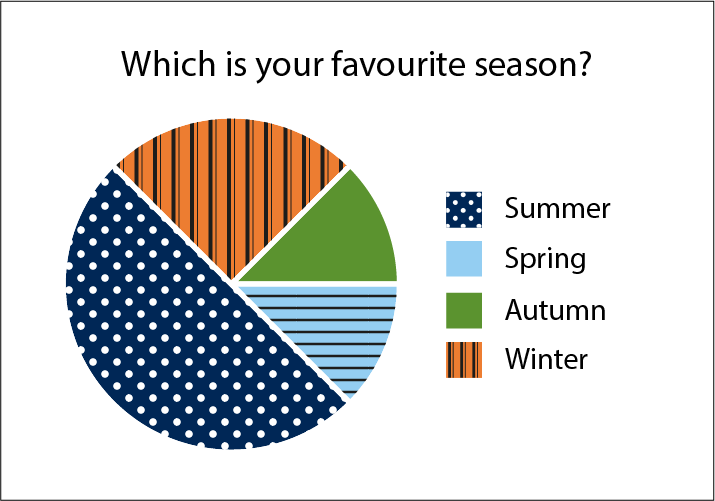
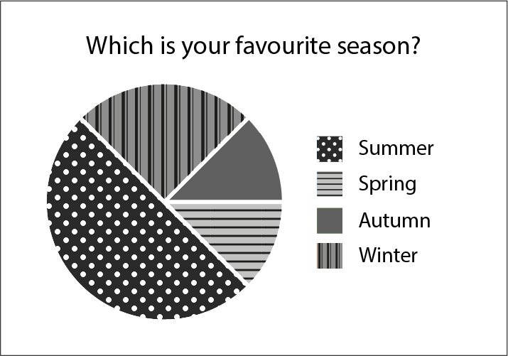
The pie-charts below display some results to the question ‘which is your favourite season?’ Pie-Chart 1 uses a key where only colour is used to denote the four seasons. Although these colours vary in hue, there is a minimal contrast in tone between these four colours. When viewed in greyscale it becomes very challenging to differentiate between the colours. For people with certain types of colour vision deficiency this pie-chart would be meaningless. Whereas, Pie-Chart 2 uses both pattern and colour to mitigate this and make the information more accessible. Can you think of any other ways to make Pie-Chart 1 more accessible? Let us know in the comments.
Pie Chart 1
Pie Chart 1 – Greyscale
Pie Chart 2
Pie Chart 2 – Greyscale
Original images created with mock data by the Authors
It is time to choose your colour palette! If you already have a well established colour palette, you could check this for any accessibility issues. You may wish to use the tools we have mentioned on this page, or see if you can find your own tools.
The importance of fonts – how they help and hinder your content.
Fonts and readability/accessibility.
Fonts and Typefaces
Every day we are confronted with a variety of typefaces and lettering styles, whether it be public information on a noticeboard, an infographic while scrolling on your phone, or a chapter in a textbook. As a University we have access to a variety of typefaces and fonts, but lettering that works well for commercial projects does not always work for educational content. It is vital that the fonts we use to present our information is clear and easy to read.
Consider the fonts you usually use and why you choose them. Are your fonts easy-to-read? Do you use standard, default fonts such as Calibri or something more decorative?
Choosing your Fonts
While adding a personal creative flair to your material is what makes it individual to you, and personable to your audience, there is a danger that content can become difficult to read if an inappropriate font is selected. Ultimately, adding a decorative font may seem like a fun way to engage your audience, but it can have the opposite effect.
Out of the two, which font would you consider to be more successful at delivering information?
Example 1 is Arial, and example 2 is Magneto Bold. As a communicator it is your responsibility to provide information that is easily legible and understandable to the widest audience possible. In example 1 (Arial) the letters stand on their own, and the typography of the characters – the curves and straight lines, for example – are easily distinguishable. In example 2, however, the joint lettering and curves merge the letters together, making them harder to read. The letters are bold (which can be a good way to highlight your information) but in this case, it provides no further legibility.
Accessibility
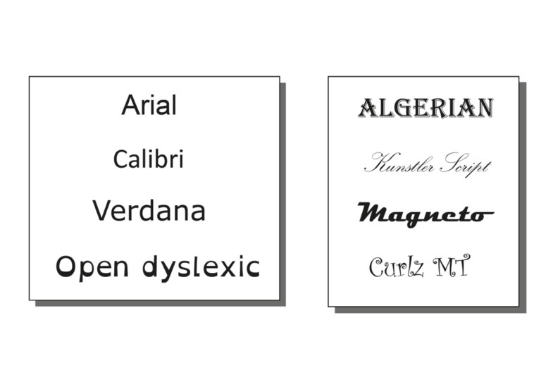
Perhaps you can read both of the examples above equally well. However, before choosing something that works for you, consider the needs of your audience. People with dyslexia can find certain fonts difficult to read, as letters can be read as shapes. The more distinguishable the character, the easier it is for your audience to intake the information you are presenting. Below are a few examples of fonts to consider. Which fonts would you consider more accessible?
As well as benefiting people with reading disabilities, clear fonts can benefit everyone. Consider an audience whose first language is not English, for example. It is important to engage everyone equally. Using fonts that have good letter spacing and easily distinguishable characters can improve intake of information, and you will find it easier to reach your audience as a whole.
Open dyslexic is an open-source typeface that has been created to increase readability for readers with dyslexia. You can download this font from the open dyslexic website. Please make yourself aware of any licence agreements when downloading fonts. See this complete guide to font licensing for designers for more information.
Taking a look at some examples of different types of media.
Useful resources and software for creating your content.
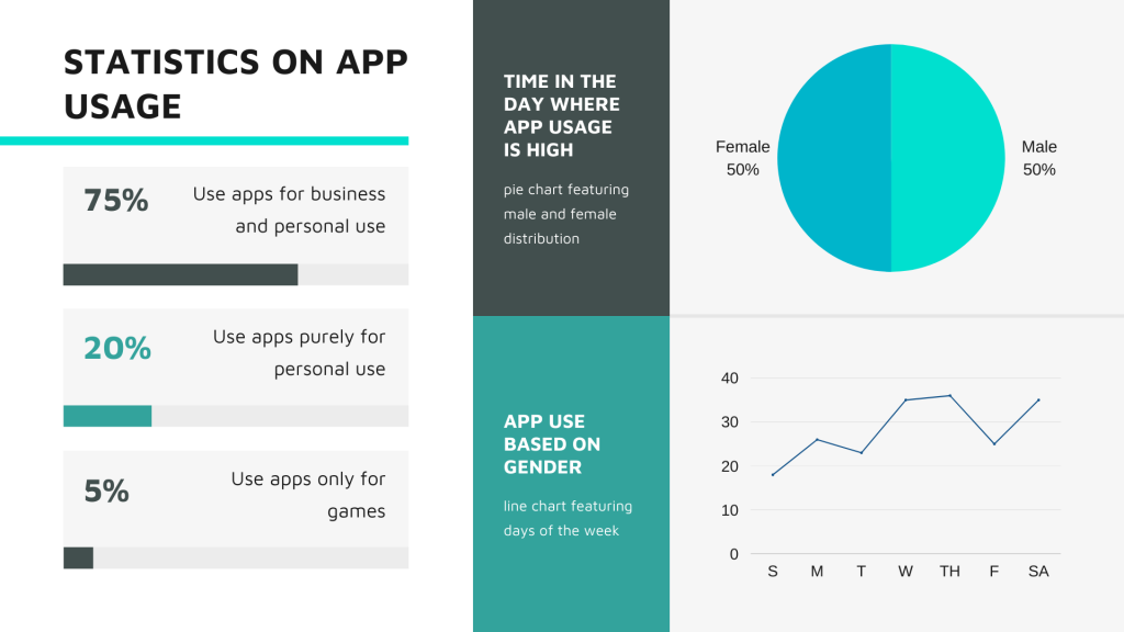
Infographics
An infographic can be described as a visual representation of information or data. This may be in the form of an infographic poster or an image within a presentation, for example. Infographics can work really well to explain processes or to simply complex data into something visual (this is also known as data visualisation).
Using infographics
Below are some ways you may wish to use an infographic. Can you think of any more?
A visual overview of weekly activities in a module
Represent results of an experiment
Simplify a complex set of instructions
Graphical abstract for a paper
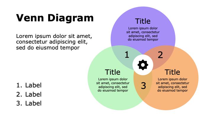
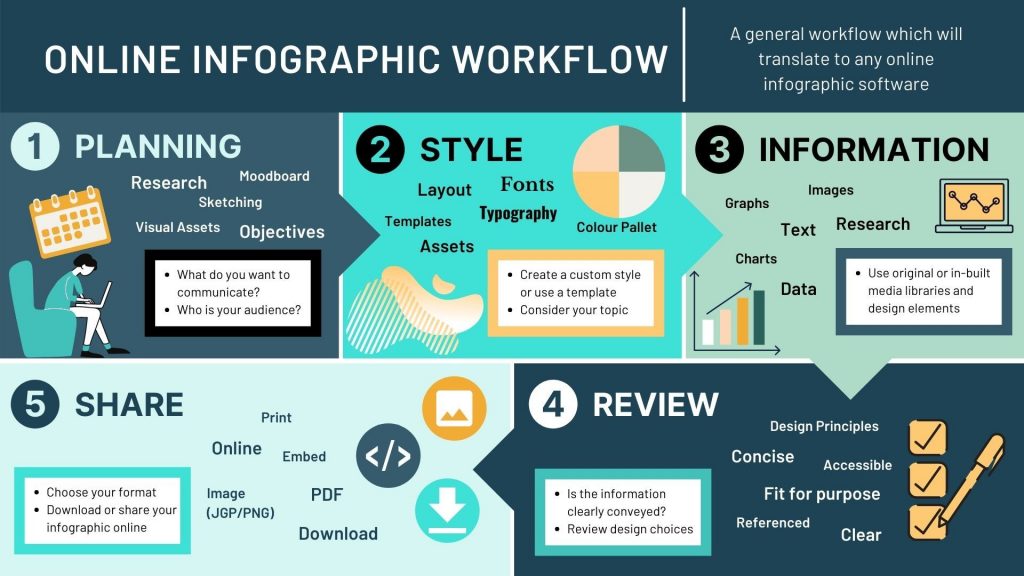
Venn Diagram – Created using PowerPointInfographic Poster – Adapted from a Canva TemplateLecture Breakdown Infographic – Created using CanvaWorkflow Infographic – Created using Canva
Infographics – Software and Resources
Using MS office, you will find that you can use basic shapes, icons and charts to create infographics for your content. This video by Educational Technologist, James Kieft shows you how to create an infographic in PowerPoint.
There are also many infographic software websites available online including Canva (sign-up required) and Adobe Spark (sign-in with staff email address). These sites offer you a range of templates, in-built tools and media to help you get creative.
We have used presentation slides as examples throughout this Learning X series. In summary, when designing your presentation slides you should consider:
Consistency, such as the colours used or the placement of headings
Visual hierarchy and layout
The balance between text and graphic elements
Sufficient negative space and consistent margins
Significant contrast between colours (particularly text and background)
Simple, clear typefaces and fonts
Design and Accessibility for PowerPoint
PowerPoint Video 1 – Improving Design Accessibility
It is worth thinking about files in which your audience cannot easily edit the formatting (for example, a video or PDF). If you provide an additional copy of the original file (for example, a PowerPoint presentation) the text, the colours and the design can be customised by the audience to meet any specific needs they have. Text can be increased in size or the colours changes for any visual or neurological needs. It is still important to keep to professional standards and use a design that is accessible as possible from the get-go.
By now you should have made some progress with your design and have hopefully started to think about developing your visual style. The next stepping stone is to ‘finalise your visuals’. This will be dependent on the type of content you are creating. It may be creating slides for a pre-recorded lecture or adding text / images to an infographic.
Today’s is mainly about research and discussion. Let us know how you have been getting on so far in the comments. Please reach out with any questions you may have.
At this point you may have a draft piece of content, a finished design or you may still want to refine your ideas. Once you have a solid design plan or a first draft you can review what you have created to avoid any mishaps later. Often it can help to have a short break from working on your content and come back to it to review it.
Other than reviewing the design principles we have mentioned, you may also want to consider:
Is the piece visually engaging? Is it too visually distracting?
Have you communicated your message clearly and concisely?
Can you ask a colleague to critique your design?
Have you checked for accessibility issues?
Once you are happy with your content it is time to prepare it for delivery and release it to your audience.
Conclusion
We hope you have enjoyed this Learning X and have found it useful. Please do come back to the resources we have provided and feel free to use our stepping stones approach when designing or redesigning your content in the future.
There will be a short Q&A session next week in the EduZone 2.0 channel to carry on the discussion and respond to any questions we have gained (University of Dundee staff only).
Ask us your questions and provide us with feedback anonymously via this mentimeter(<5 mins).