Summary
- Planning the sequence and visual hierarchy of your content.
- Designing a well-structured and consistent layout.
Sequence
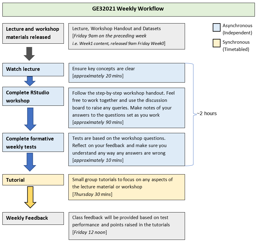
When planning a lecture, seminar or workshop you consider the sequence of activities and structure of your session in order to optimise the student experience. This thinking can be applied to the design of your learning materials, whether it be the sequence of a video or the layout of an infographic. A well-structured design can allow information to be communicated in a way that is memorable and easy to understand.
Visual Hierarchy
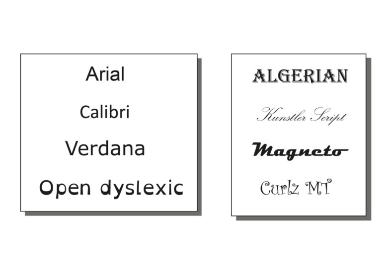
Considering visual hierarchy can help you to communicate a message clearly by highlighting important information and reducing extraneous load. This is particularly important with a set of instructions or a process, but can be applied to any content. The visual hierarchy of a design determines the sequence in which the audience views your content and visually ranks elements in terms of importance. You can use design elements such as scale, colour/contrast, layout and typeface to visually rank your content. Richard Mayer’s Signalling Principle states that “people learn better when cues that highlight the organization of the essential material are added.” (2009a, p. 108) However, this should be done subtly as not to overwhelm.
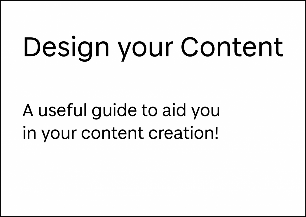
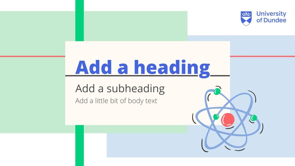
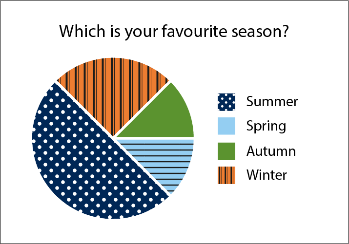
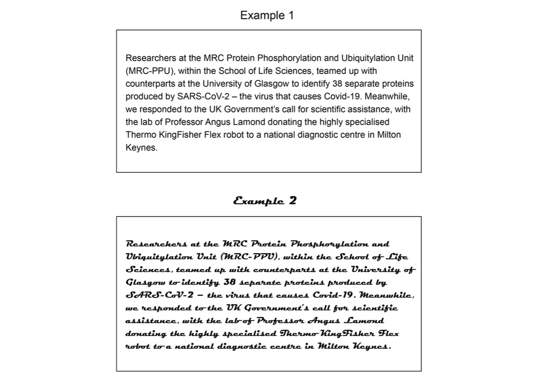
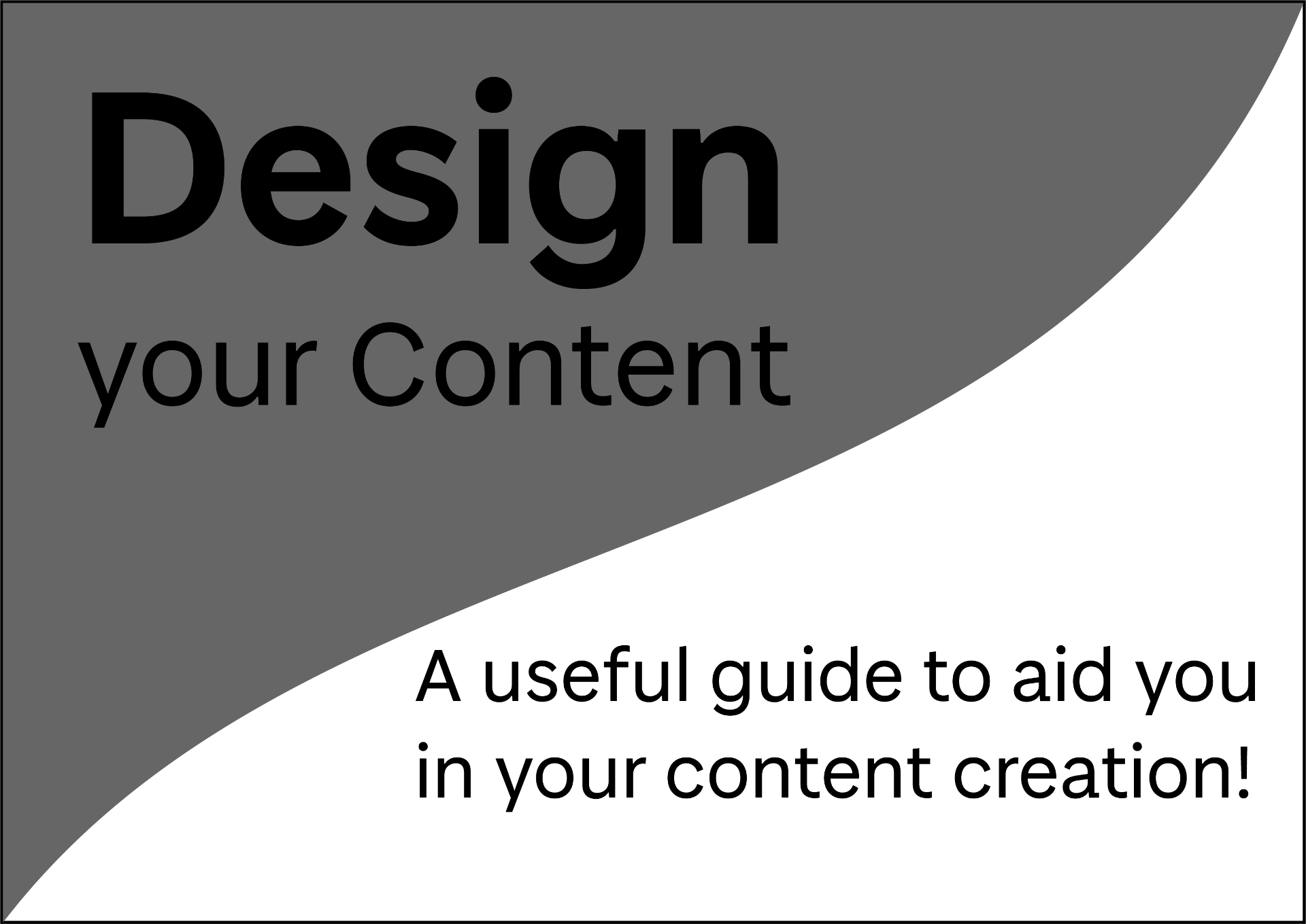
Visual Hierarchy: Example 1 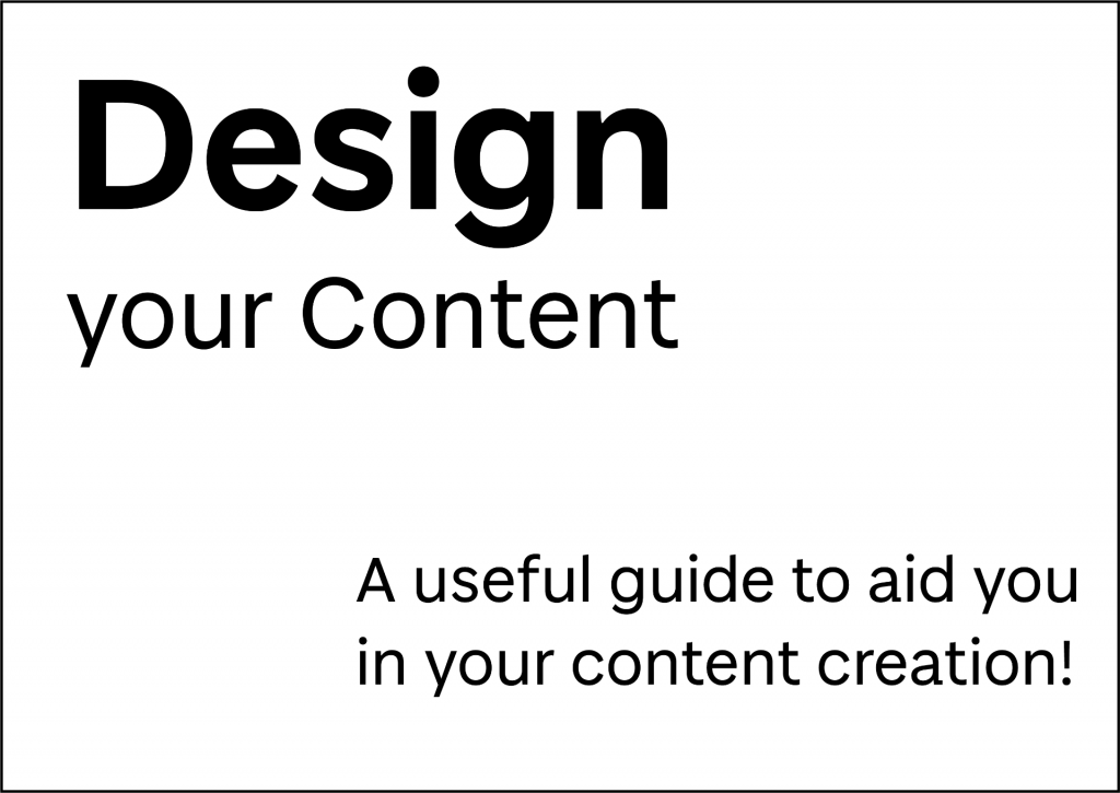
Visual Hierarchy: Example 2 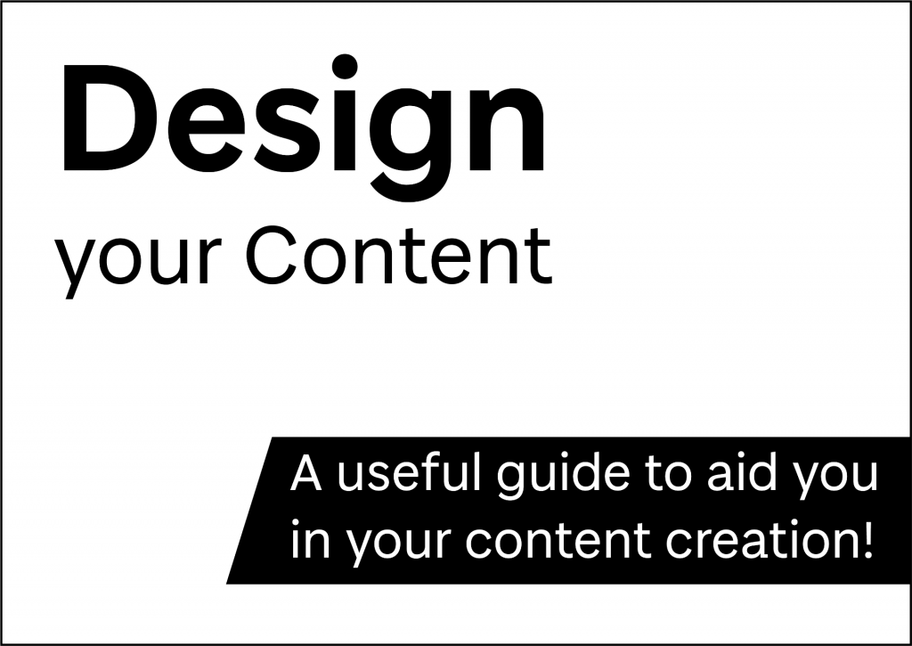
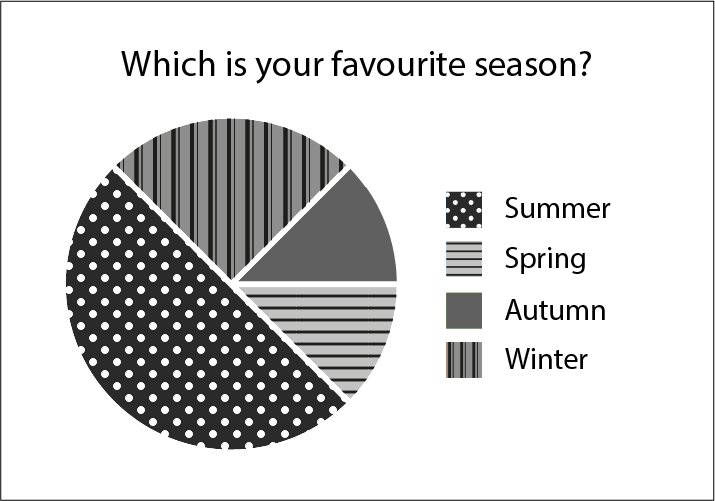
Visual Hierarchy: Example 3 
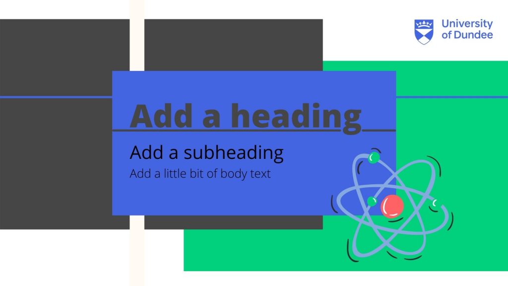
Visual Hierarchy: Example 4
The examples above show how simple changes in design can affect the visual importance of an element. In example 1 you notice the title first and then the subheading, but at glance neither particularly stand out. In example 2 the title is much more pronounced, particularly the word ‘design’. In example 3 the title and subheading appear more balanced by adding a high contrast shape behind the subtitle. In example 4 the low contrast of the shape behind the title changes the balance so that the subtitle stands out the most. To help you with visual hierarchy ask yourself – which is the most important information? Is the reading order clear? What stands out on the page?
Layout
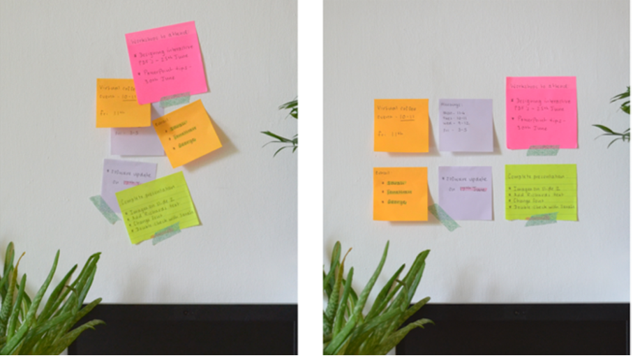
To get you to start thinking about layout, lets have a look at some post-it notes. Post-it notes are designed to organise key segments of information, and these should be clear at a glance for optimum efficiency. If their layout is not carefully considered, and the post-it notes are overlapped, information can be forgotten or disregarded – the same applies to designing the layout of your material. Post-it notes can be a great tool for planning both sequence and layout of your content.
Planning your Layout
When designing the layout of your content, as well as the sequence of information you should also consider:
- The balance between text and graphic elements. This will be dependent on your subject and the type of content that you are creating. This summary of Mayer’s Multimedia Learning Principles (2009b) includes some practical advise on the balance of text and images.
- The alignment of your text and graphic elements. Is your text all left-aligned or does it change throughout? Are your images neatly arranged? Many of the tools you can use to create your content, such as Microsoft office, have built-in alignment tools.
- Margins and negative space. Is there significant space between the edge of the page and your text/visual elements? Avoid over-crowding your pages or slides as this can be difficult to read and absorb information.
- Orientation and aspect ratio. Is your page portrait or landscape? Does it have to be A4 or can it be custom? If you are creating a video, the standard aspect ratio is 16:9.
- Consistency. Remember an element of consistency throughout your layout will improve the usability of your content.
Reviewing your Layout
When you begin to add text and graphic elements to your design you may have to readjust your layout as you go along. Remember that the steps we describe in this Learning X are like stepping stones, they are not one-way, you can go back and forth through the steps until you are happy with your design.
Let’s take a look at how the layout of our ‘Design your Content poster’ changed throughout the design and creation process. First we started with a very simple hand-drawn sketch with block shapes and a rough idea of where the title would be. This sketch was then digitised blocking out the shapes in greyscale. As content was added to the poster the layout changed and was refined until we reached the final design. Notice how the blocks of content are neatly aligned and there is a margin between the content and the edge of the page. Is there anything you would change about this final layout? Does the visual hierarchy flow in a way you would expect? Let us know your thoughts in the comments.
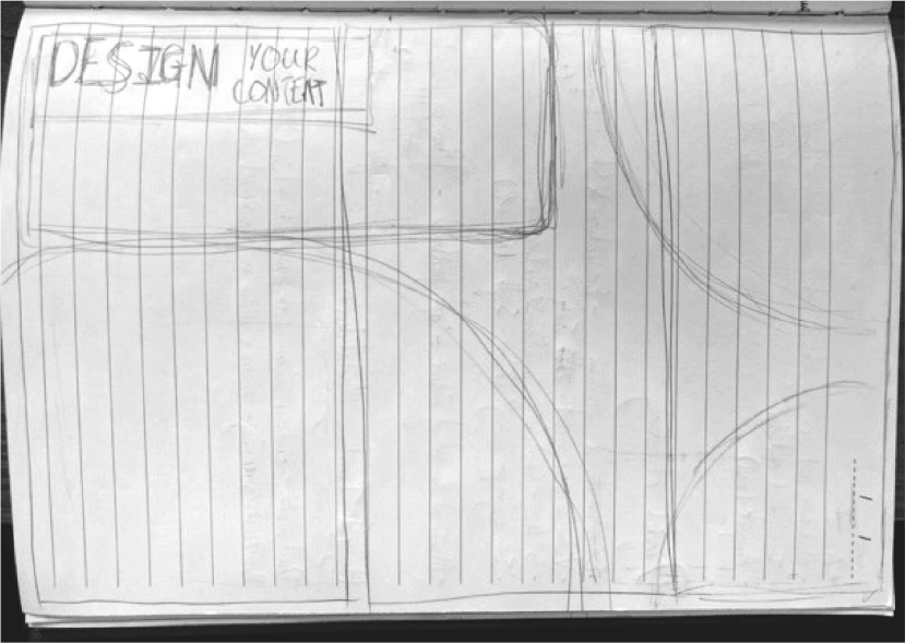
Initial hand-drawn sketch 
Digitised sketch 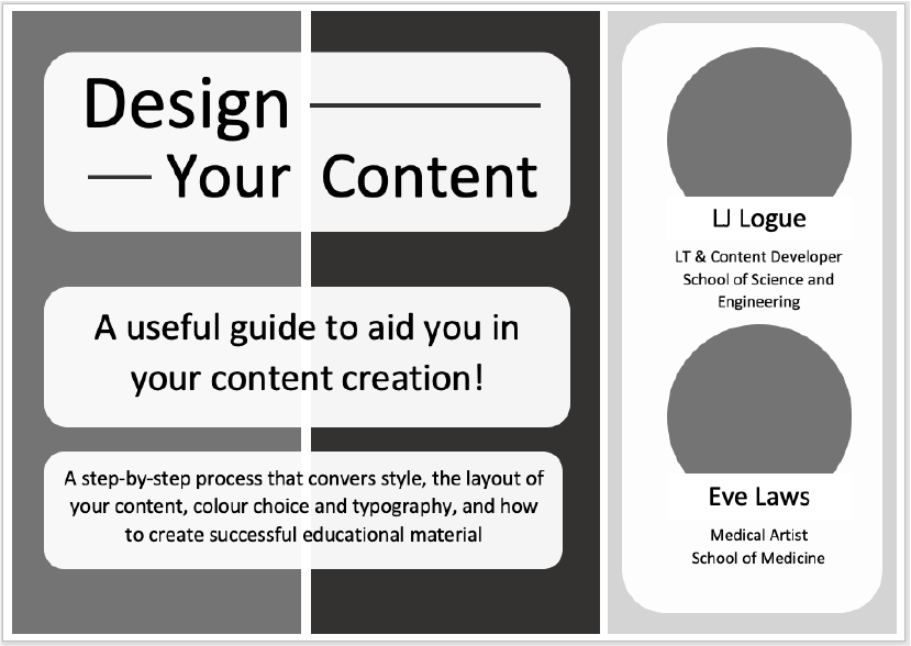
Refined layout 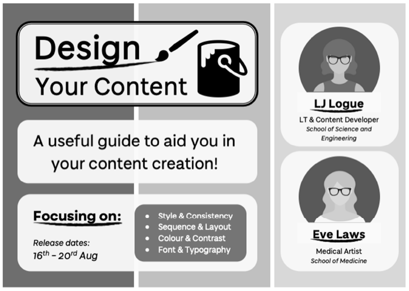
Final layout
Accessibility
Visual hierarchy can highlight key points in your design to improve the intake of information presented. However, remember that the underlying structure of your documents should also be optimised so that students with visual impairments or mobility needs can navigate the content effectively. You can check the reading order of your PowerPoint slides using the reading order pane and PDFs using Adobe Acrobat’s reading order tool. You may also wish to use a screen-reader tool to check your content.
As highlighted in the University of Dundee guide – creating inclusive teaching materials – Microsoft’s in-built tools can be used to ensure the structure of your content is accessible:
‘Use Styles in MS Word (Heading 1, 2, etc.) to help students navigate the content. In PowerPoint, use the Title box for slide titles and make sure these are unique. This will improve the experience for any student using a screen-reader and will improve readability for all.’
Further Reading
- The Ultimate Guide to Visual Hierarchy – Canva Learn
- Key Principles of Visual Hierarchy in UX Design – Adobe UX Ideas
- Mayer, R. E. (2009a). Multimedia learning (2nd ed.). Cambridge, England: Cambridge University Press.
- Multimedia Learning Principles Summary – Adapted from Mayer, R. E. (2009b)
Activity
Steppingstone – Day 3: Plan your Layout
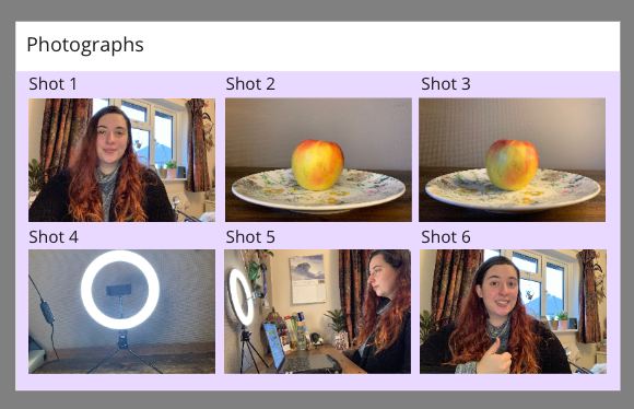
Take a few minutes to create a rough plan of the layout or sequence of your content, considering the points mentioned above. Do not consider the colour scheme or fonts just yet, as these will be covered on the following pages. Here are some ideas of how you could go about this:
For posters, infographics, or PDFs:
- Create a quick sketch (stick men or rough shapes will do fine)
- Use sticky notes on an A4 piece of paper
- Use an interactive whiteboard such as padlet
For videos or presentations:
- Take inspiration from this Video Sequence Padlet
- Create a storyboard with rough sketches or photographs